CRIM250 Assignment
Assignment 1
Collaborators: Lorem Ipsum.
This assignment is due on Canvas on Monday 9/20 before class, at 10:15 am. Include the name of anyone with whom you collaborated at the top of the assignment.
Problem 1
Install the datasets package on the console below using install.packages("datasets"). Now load the library.
#install.packages("datasets")
library(datasets)Answer: Line51 install the package(I#it out because it only need to be done once). Line52 load the library.
Load the USArrests dataset and rename it dat. Note that this dataset comes with R, in the package datasets, so there’s no need to load data from your computer. Why is it useful to rename the dataset?
# This line load the USArrests dataset and rename it `dat`
dat <- USArrestsAnswer: It is important to rename the dataset for the following reasons: 1. It save time typing a long name. 2. It avoid contaminating the data so that the data is replicable.
Problem 2
Use this command to make the state names into a new variable called State.
dat$state <- tolower(rownames(USArrests))This dataset has the state names as row names, so we just want to make them into a new variable. We also make them all lower case, because that will help us draw a map later - the map function requires the states to be lower case.
List the variables contained in the dataset USArrests.
# I think both of them work as they produce the same results but with different sequences.
names(dat)
## [1] "Murder" "Assault" "UrbanPop" "Rape" "state"ls(dat)## [1] "Assault" "Murder" "Rape" "state" "UrbanPop"Answer: “Assault”, “Murder”, “Rape”, “state”, and “UrbanPop”.
Problem 3
What type of variable (from the DVB chapter) is Murder?
Answer: Quantitative variable
What R Type of variable is it?
Answer: Numeric(as indicated in the Format part of the description of the dataset)
Problem 4
What information is contained in this dataset, in general? What do the numbers mean?
Answer: The dataset contains the statistic of the violent crime rate of 3 different kinds of crime in the 50 US States in 1973. It also contains the percentage of urban population in these states. The number means the number of arrests per 100000 people for murder, rape, and assault. The number also means percentage urban population for UrbanPop.
Problem 5
Draw a histogram of Murder with proper labels and title.
hist(dat$Murder, main="US Murder", xlab="Murder/100000 residents", ylab="States")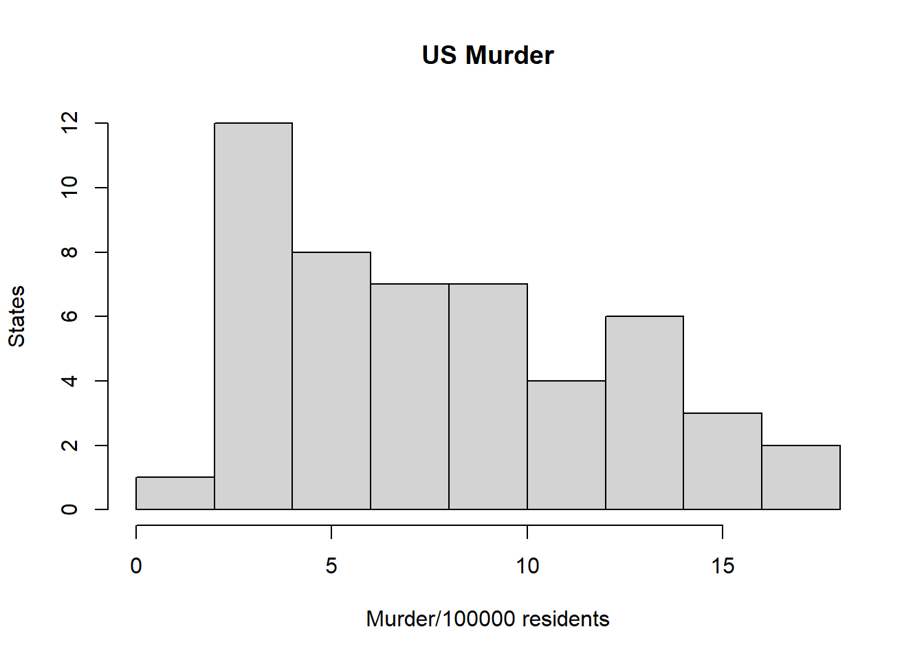
Problem 6
Please summarize Murder quantitatively. What are its mean and median? What is the difference between mean and median? What is a quartile, and why do you think R gives you the 1st Qu. and 3rd Qu.?
summary(dat$Murder)## Min. 1st Qu. Median Mean 3rd Qu. Max.
## 0.800 4.075 7.250 7.788 11.250 17.400Answer: The Mean is 7.788 and the Medium 7.250. THe difference between mean and median is 0.538. A quartile is one of the four parts that the data is divided into, and ithe data must be arranged from smallest to largest. R give me 1st Qu. and 3rd Qu. becasue it provides me information of the distribution and the shape of the data.
Problem 7
Repeat the same steps you followed for Murder, for the variables Assault and Rape. Now plot all three histograms toghether. You can do this by using the command par(mfrow=c(3,1)) and then plotting each of the three.
par(mfrow=c(3,1))
hist(dat$Murder, main="US Murder", xlab="Murder/100000 residents", ylab="States")

hist(dat$Assault, main="US Assault", xlab="Assault/100000 residents", ylab="States")

hist(dat$Rape, main="US Rape", xlab="Rape/100000 residents", ylab="States")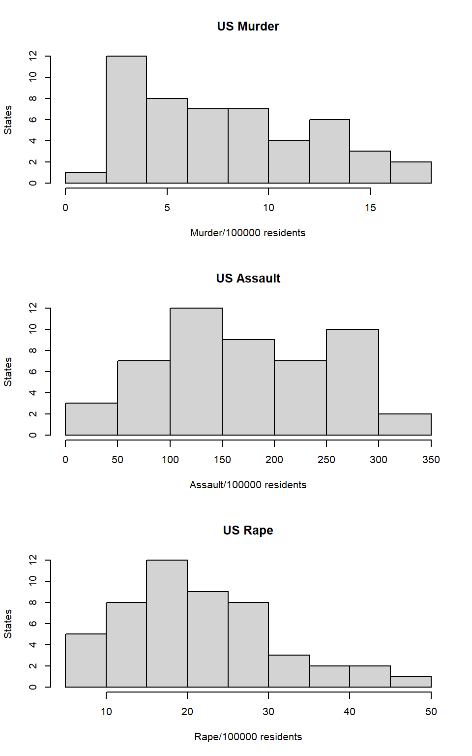
What does the command par do, in your own words (you can look this up by asking R ?par)?
Answer: The Command par set the graphical parameters for the histogram that I just plotted. It set the graph to be draw in a three row and one column setting.
What can you learn from plotting the histograms together?
Answer:We can compare the shape of the histograms to find the difference of the overall trend. We can also compare the max and min more visually. We can also have a direct representation that is more clear than a chart with numbers.
Problem 8
In the console below (not in text), type install.packages("maps") and press Enter, and then type install.packages("ggplot2") and press Enter. This will install the packages so you can load the libraries.
Run this code:
#install.packages("maps")
#install.packages("ggplot2")
library('maps')
library('ggplot2')

ggplot(dat, aes(map_id=state, fill=Murder)) +
  geom_map(map=map_data("state")) +
  expand_limits(x=map_data("state")$long, y=map_data("state")$lat)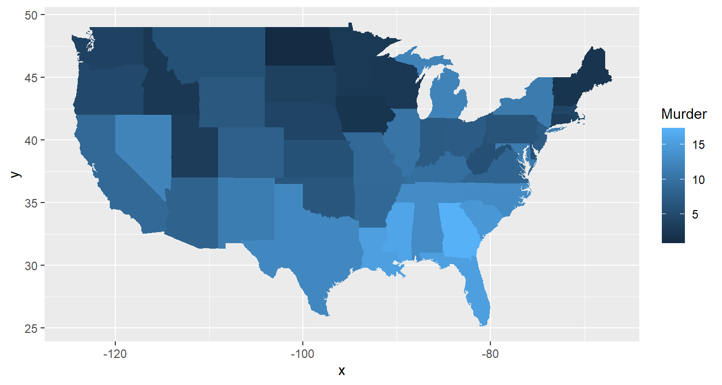
What does this code do? Explain what each line is doing.
Answer: The first line construct an aesthetic mapping from the dataset “dat” with the map id being state and each state is filled with the data “Murder”.The second assign map data of variable “state” to the annotation of geom_map. The next two lines expand the plot’s limit using the data from the variable “state” for its x and y axis.
Assignment 2
Instructions: Copy your code, paste it into a Word document, and turn it into Canvas. You can turn in a .docx or .pdf file. Show any EDA (graphical or non-graphical) you have used to come to this conclusion.
Problem 1: Load data
Set your working directory to the folder where you downloaded the data.
Answer:Select dat.nsduh.small.1.csv from the file on the bottomright and import the dataset.
Read the data
library(readr)
dat<- read_csv("dat.nsduh.small.1.csv")
What are the dimensions of the dataset?
names(dat) ## [1] "mjage" "cigage" "iralcage" "age2" "sexatract" "speakengl"
## [7] "irsex"Answer:The dataset has two dimensions. The first dimension is the 171 observations, and the second dimension is the 7 variables “mjage”, “cigage”, “iralcage”, “age2”, “sexatract” “speakengl” “irsex”.
###Problem 2: Variables Describe the variables in the dataset.
summary(dat)## mjage cigage iralcage age2
## Min. : 7.00 Min. :10.00 Min. : 5.00 Min. : 4.00
## 1st Qu.:14.00 1st Qu.:15.00 1st Qu.:13.00 1st Qu.:13.00
## Median :16.00 Median :17.00 Median :15.00 Median :15.00
## Mean :15.99 Mean :17.65 Mean :14.95 Mean :13.98
## 3rd Qu.:17.50 3rd Qu.:19.00 3rd Qu.:17.00 3rd Qu.:15.00
## Max. :35.00 Max. :50.00 Max. :23.00 Max. :17.00
## sexatract speakengl irsex
## Min. : 1.00 Min. :1.00 Min. :1.000
## 1st Qu.: 1.00 1st Qu.:1.00 1st Qu.:1.000
## Median : 1.00 Median :1.00 Median :1.000
## Mean : 3.07 Mean :1.07 Mean :1.468
## 3rd Qu.: 1.00 3rd Qu.:1.00 3rd Qu.:2.000
## Max. :99.00 Max. :3.00 Max. :2.000Answer: The variablesin the dataset all all numeric variables in R. mjage, cigage, iralcage, and age2 are quantitative variables, and sexatract, speakengl, and irsex are categorical variables.
What is this dataset about? Who collected the data, what kind of sample is it, and what was the purpose of generating the data?
Answer:This dataset is about the national drug use of United States in 2019. The data is collected by NSDUH which directed by Substance Abuse and Mental Health Services Administration of United States. The purpose of generating these data is to monitor the usage of drugs and support prevention and treatment programs.
Problem 3: Age and gender
What is the age distribution of the sample like? Make sure you read the codebook to know what the variable values mean.
summary(dat$age2)## Min. 1st Qu. Median Mean 3rd Qu. Max.
## 4.00 13.00 15.00 13.98 15.00 17.00hist(dat$age2,xlab="age", ylab="counts")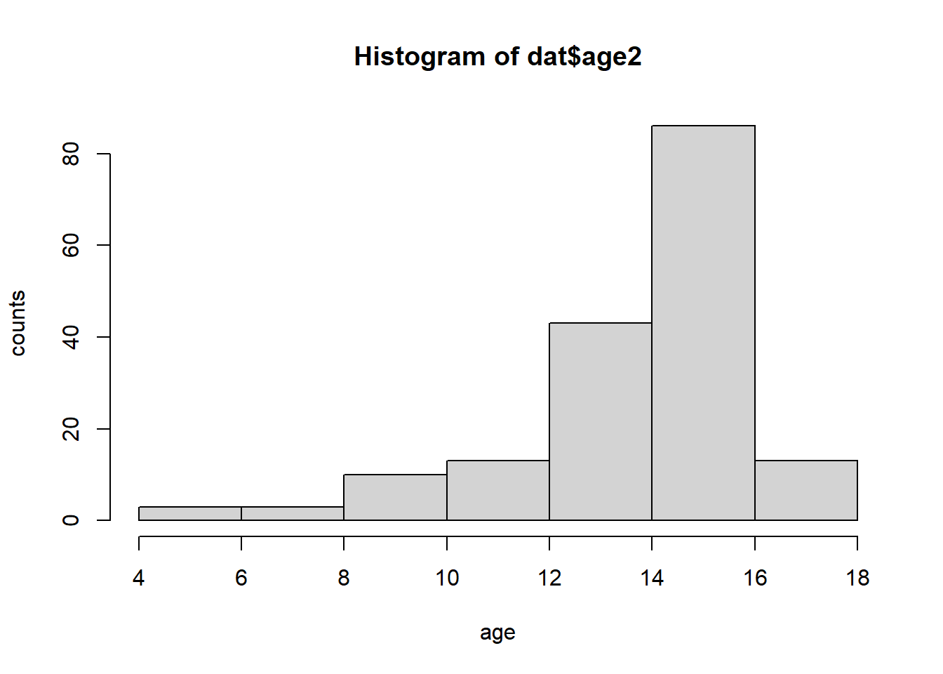
Answer: The ages of the survey range from 15 years old to 65 years old or older. The data is largely skewed to the left with a peak at the respondent group of 35-49 years old.
Do you think this age distribution representative of the US population? Why or why not?
Answer: I don’t think this age distribution is representative. First, this survey doesn’t include any people whose age is younger than 12, and that doesn’t represent U.S. population. Also, since this survey is used to monitor drug uses, their sampling method might not be random and thus not represetative of the U.S. population.
Is the sample balanced in terms of gender? If not, are there more females or males?
summary(dat$irsex)## Min. 1st Qu. Median Mean 3rd Qu. Max.
## 1.000 1.000 1.000 1.468 2.000 2.000Answer: The sampling is not balanced in term of gender. There are more males than females.
Use this code to draw a stacked bar plot to view the relationship between sex and age. What can you conclude from this plot?
tab.agesex <- table(dat$irsex, dat$age2)
rownames(tab.agesex) <- c("Male", "Female")
barplot(tab.agesex,
        main = "Distribution of Age by gender",
        xlab = "Age category", ylab = "Frequency",
        legend.text = rownames(tab.agesex),
        beside = FALSE) # Stacked bars (default)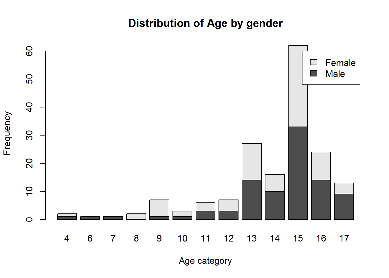
Answer: We can conclude from the graph that in younger population, more females are in the survey than males, but in older populations, more males are in the survey tha females. Most importantly, there are roughly the same numbers of males and females in age category 15 which is the biggest category.
Problem 4: Substance use
For which of the three substances included in the dataset (marijuana, alcohol, and cigarettes) do individuals tend to use the substance earlier?
par(mfrow=c(3,1))
hist(dat$mjage,xlab="age/mj", ylab="counts", xlim=c(0,50))
hist(dat$cigage,xlab="age/cig", ylab="counts", xlim=c(0,50))
hist(dat$iralcage,xlab="age/al", ylab="counts", xlim=c(0,50))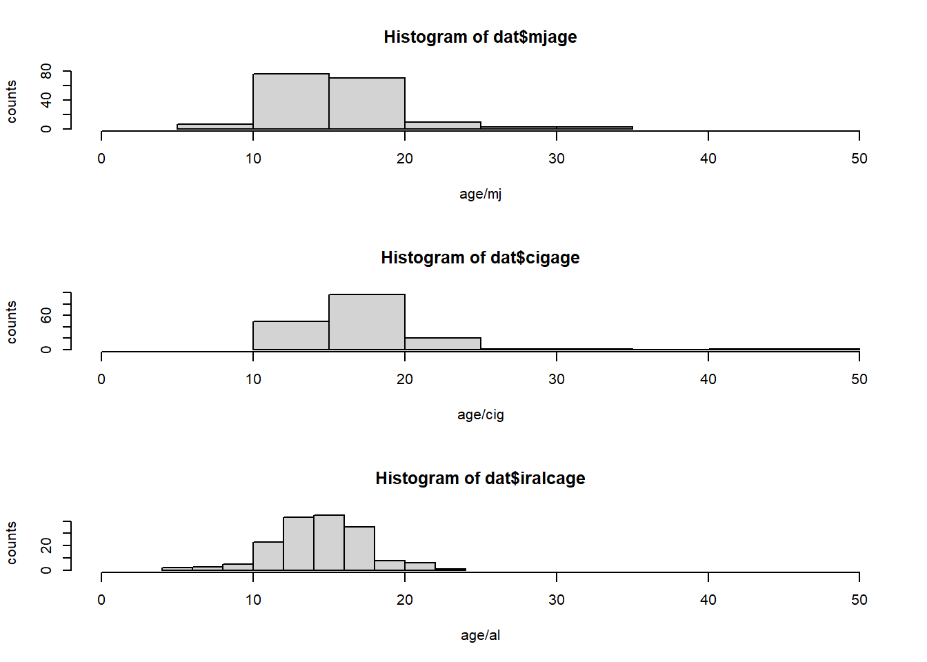
Answer: According to the data, it seems that people tend to use alcohol earlier because the youngest alcohol user is at age 5, and the mean and median of alcohol usage is the lowest among the three drugs.
Problem 5: Sexual attraction
What does the distribution of sexual attraction look like? Is this what you expected?
dat$sexatract.no.nas <- ifelse(dat$sexatract==99, NA, dat$sexatract)
tab.sexatract <- table(dat$sexatract.no.nas)
rownames(tab.sexatract) <- c("Only Opposite", "Mostly Opposite", "Equal","Mostly Same","Only Same","Not Sure")
barplot(tab.sexatract,xlab="sex", ylab="counts", lengend=TRUE)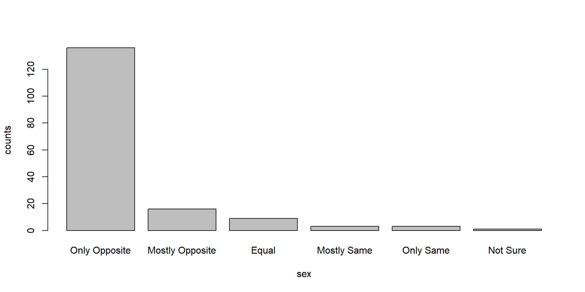
Answer: The distribution of the sexual attraction is strongly skewed to the left. This is expected because sexual attraction to the same sex is still minority in the society, and people might not feel comfortable to disclose their sexual orientation if they are the minorities in the survey.
What is the distribution of sexual attraction by gender?
par(mfrow=c(2,1))
dat.onlyfemale <- dat[dat$irsex==2,]
tab.onlyfemale <- table(dat.onlyfemale$sexatract.no.nas)
rownames(tab.onlyfemale) <- c("Only Opposite", "Mostly Opposite", "Equal","Mostly Same","Only Same")
barplot(tab.onlyfemale,xlab ="Sexual Attraction of Females", ylab ="counts")
dat.onlymale <- dat[dat$irsex==1,]
tab.onlymale <- table(dat.onlymale$sexatract.no.nas)
rownames(tab.onlymale) <- c("Only Opposite", "Mostly Opposite","Mostly Same","Only Same","Not Sure")
barplot(tab.onlymale,xlab="Sexual Attraction of Males", ylab="counts")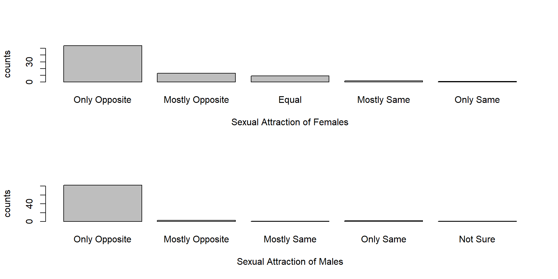
Answer: It is clear that for both gender the graph is strongly skewed to the right, but the for males it is more skewed than for females. That means homosexuality is minority in both cases, but there are percentage of homosexual males than females.
Problem 6: English speaking
What does the distribution of English speaking look like in the sample? Is this what you might expect for a random sample of the US population?
summary(dat$speakengl)## Min. 1st Qu. Median Mean 3rd Qu. Max.
## 1.00 1.00 1.00 1.07 1.00 3.00tab.speakengl <- table(dat$speakengl)
rownames(tab.speakengl) <- c("Very well", "Well", "Not Well")
barplot(tab.speakengl,xlab="English Ability", ylab="counts", legend=TRUE)
Answer: The distribution is strongly skewed to the right with a peak at 1. This means that the majority of the participants speak English very well. Given the fact that it is in the U.S., this is what I would expect from a simple random sample of U.S. population.
Are there more English speaker females or males?
library(ggplot2)
gender.labs <- c(`1`="Male", `2`="Female")
ggplot(data=dat, aes(x=speakengl))+
  geom_bar(na.rm=TRUE)+
  facet_grid(irsex ~ ., labeller=as_labeller(gender.labs))+
  labs(title="Distribution of English ability by gender", y="Frequency")+
  scale_x_discrete(name ="English ability",
                     limits=c("Very well","Well","Not well","Not at all"))
Answer: There are more English speaking males than females.
Exam 1
Instructions
Create a folder in your computer (a good place would be under Crim 250, Exams).
Download the dataset from the Canvas website (fatal-police-shootings-data.csv) onto that folder, and save your Exam 1.Rmd file in the same folder.
Download the README.md file. This is the codebook.
Load the data into an R data frame.
library(readr)
fatal_police_shootings_data <- read_csv("C:/Users/Gluttonous Kangaroo/Desktop/Penn Works/CRIM 250/Exam/fatal-police-shootings-data.csv")
dat <- fatal_police_shootings_data
Problem 1 (10 points)
- Describe the dataset. This is the source: https://github.com/washingtonpost/data-police-shootings . Write two sentences (max.) about this.
Answer: This is a dataset by Washington Post which contains records of every fatal shooting in the United States by a police officer who is in the line of duty since Jan. 1, 2015.
- How many observations are there in the data frame?
#Look at the dat data frame on the right under the option of Environment.Answer: There are 6594 observations in the dataframe
- Look at the names of the variables in the data frame. Describe what “body_camera”, “flee”, and “armed” represent, according to the codebook. Again, only write one sentence (max) per variable.
summary(dat)## id name date manner_of_death
## Min. : 3 Length:6594 Min. :2015-01-02 Length:6594
## 1st Qu.:1860 Class :character 1st Qu.:2016-09-01 Class :character
## Median :3662 Mode :character Median :2018-04-21 Mode :character
## Mean :3651 Mean :2018-05-05
## 3rd Qu.:5437 3rd Qu.:2020-01-06
## Max. :7194 Max. :2021-09-25
##
## armed age gender race
## Length:6594 Min. : 6.00 Length:6594 Length:6594
## Class :character 1st Qu.:27.00 Class :character Class :character
## Mode :character Median :35.00 Mode :character Mode :character
## Mean :37.12
## 3rd Qu.:45.00
## Max. :91.00
## NA's :308
## city state signs_of_mental_illness
## Length:6594 Length:6594 Mode :logical
## Class :character Class :character FALSE:5100
## Mode :character Mode :character TRUE :1494
##
##
##
##
## threat_level flee body_camera longitude
## Length:6594 Length:6594 Mode :logical Min. :-160.01
## Class :character Class :character FALSE:5684 1st Qu.:-112.09
## Mode :character Mode :character TRUE :910 Median : -94.31
## Mean : -97.16
## 3rd Qu.: -83.12
## Max. : -67.87
## NA's :314
## latitude is_geocoding_exact
## Min. :19.50 Mode :logical
## 1st Qu.:33.48 FALSE:18
## Median :36.09 TRUE :6576
## Mean :36.66
## 3rd Qu.:40.00
## Max. :71.30
## NA's :314Answer: body_camera is a categorical and logical variable that represent whether the police wear a body camera in that observation. flee is a categorical and character variable that represent whether the victim was moving away from the officer(if the victim flee, it can be done in the means of foot or car). Armed is a categorical and character varialbe that represent whether the victim equipped some level of arm that could inflict harm(status can be armed(with indication of weapons)/undetermined/unknown/unarmed)
- What are three weapons that you are surprised to find in the “armed” variable? Make a table of the values in “armed” to see the options.
tab.arm <-table(dat$armed)Answer: Air conditioner, microphone, and fire work are suprising for me to see that can be used as weapon. I think either the victims were very creative or the police officers were making misjudgements.
Problem 2 (10 points)
- Describe the age distribution of the sample. Is this what you would expect to see?
hist(dat$age,xlab="age", ylab="counts", xlim=c(0,100))
Answer: The distribution is strongly skewed to the right with one mode around age 30. This means that a large portion of the victims are adults in their mid ages. This is what I am expected to see because the police officers are more likely to see the mid age adults as potential dangers rather than children or old people.
- To understand the center of the age distribution, would you use a mean or a median, and why? Find the one you picked.
#Look at the age variable in summary(dat).
summary(dat)
## id name date manner_of_death
## Min. : 3 Length:6594 Min. :2015-01-02 Length:6594
## 1st Qu.:1860 Class :character 1st Qu.:2016-09-01 Class :character
## Median :3662 Mode :character Median :2018-04-21 Mode :character
## Mean :3651 Mean :2018-05-05
## 3rd Qu.:5437 3rd Qu.:2020-01-06
## Max. :7194 Max. :2021-09-25
##
## armed age gender race
## Length:6594 Min. : 6.00 Length:6594 Length:6594
## Class :character 1st Qu.:27.00 Class :character Class :character
## Mode :character Median :35.00 Mode :character Mode :character
## Mean :37.12
## 3rd Qu.:45.00
## Max. :91.00
## NA's :308
## city state signs_of_mental_illness
## Length:6594 Length:6594 Mode :logical
## Class :character Class :character FALSE:5100
## Mode :character Mode :character TRUE :1494
##
##
##
##
## threat_level flee body_camera longitude
## Length:6594 Length:6594 Mode :logical Min. :-160.01
## Class :character Class :character FALSE:5684 1st Qu.:-112.09
## Mode :character Mode :character TRUE :910 Median : -94.31
## Mean : -97.16
## 3rd Qu.: -83.12
## Max. : -67.87
## NA's :314
## latitude is_geocoding_exact
## Min. :19.50 Mode :logical
## 1st Qu.:33.48 FALSE:18
## Median :36.09 TRUE :6576
## Mean :36.66
## 3rd Qu.:40.00
## Max. :71.30
## NA's :314Answer: I would choose median instead of the mean mainly because there are extreme values from both side(A min for age of 6 and a max for age of 91) that can influence the distribution. Median is resistant to extreme values which is a better choice in this case. The median of age is 35.
- Describe the gender distribution of the sample. Do you find this surprising?
tab.gender <- table(dat$gender)
barplot(tab.gender,xlab="gender", ylab="counts")
Answer: The gender distribution overwhelmingly unbalanced with the vast majority of the victim being males than females. In fact, the male victims are 20 times more than the female victims. I don’t find this surprising because it is reasonable for a police officer to find a male with higher potential danger than a female.
Problem 3 (10 points)
- How many police officers had a body camera, according to news reports? What proportion is this of all the incidents in the data? Are you surprised that it is so high or low?
tab.bodycamera <- table(dat$body_camera)
barplot(tab.bodycamera,xlab="bodycamera", ylab="counts")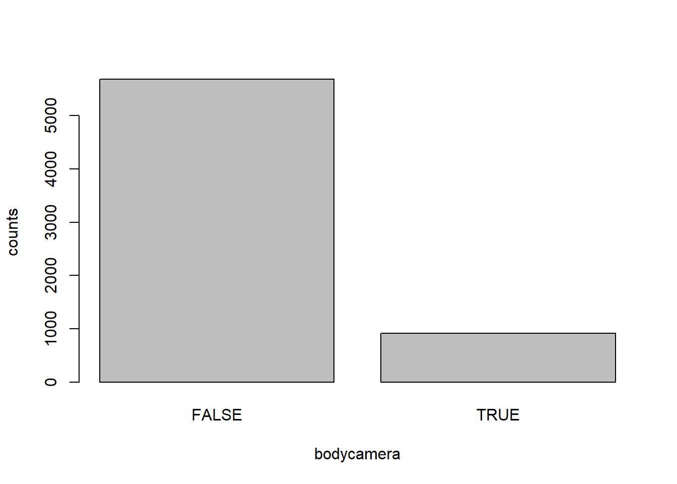
Answer: 910 police officers had a body camera. However, it is only 910/6594=13.8% of all observations. I am not surprised that the body camera rate is so low because implementing a body camera for every officer can be costly, so some underfunded police apartments which located in more poor or chaotic areas (probably more shooting incidents) might not equip their officers to save money.
- In how many of the incidents was the victim fleeing? What proportion is this of the total number of incidents in the data? Is this what you would expect?
tab.flee <- table(dat$flee)
barplot(tab.flee,xlab="flee", ylab="counts")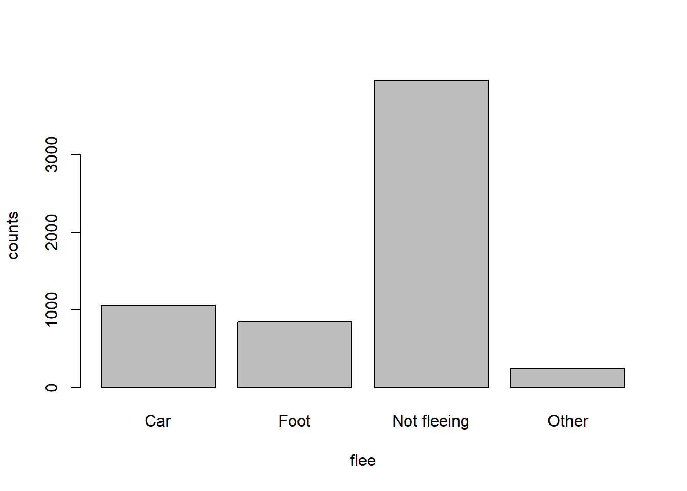
Answer:1058 of the victims flee on foot and 845 of the victims flee on car, which is 1903/6594=28.9% of the observations. This is unexpected because fleeing is usually involved with a chase and the whole process accelerate the tension of the situation. More tension is very likely to be a cause for more fatal shooting, so I am surprised by the fact that less than 30% of the victims did flee. However, in order to get the holistic picture, we must combine the variable threat level into the consideration.
Problem 4 (10 points) - Answer only one of these (a or b).
- Describe the relationship between the variables “body camera” and “flee” using a stacked barplot. What can you conclude from this relationship?
Hint 1: The categories along the x-axis are the options for “flee”, each bar contains information about whether the police officer had a body camera (vertically), and the height along the y-axis shows the frequency of that category).
Hint 2: Also, if you are unsure about the syntax for barplot, run ?barplot in R and see some examples at the bottom of the documentation. This is usually a good way to look up the syntax of R code. You can also Google it.
Your answer here.
- Describe the relationship between age and race by using a boxplot. What can you conclude from this relationship?
Hint 1: The categories along the x-axis are the race categories and the height along the y-axis is age.
Hint 2: Also, if you are unsure about the syntax for boxplot, run ?boxplot in R and see some examples at the bottom of the documentation. This is usually a good way to look up the syntax of R code. You can also Google it.
plot(factor(dat$race), dat$age, ylab="age", xlab="Race", names=c("Asian","Black","Hispanic","Native A","Other","White"))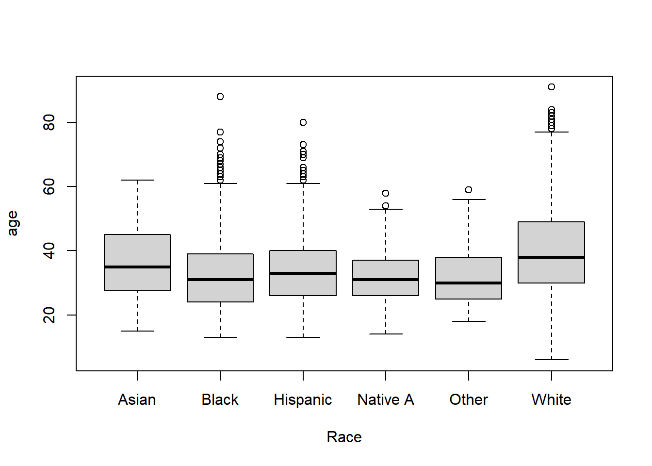
Answer: There is no straightforward correlation between age and race. However, it seems that the White victims have more spread than all the minority group victims. This means that there are White victims from all ages being shot. On the other hand, the minority groups victims are younger and more concentrated(they have less inter-quartile range and a smaller median). Also, there are many outliers of the White victims that are very old.
Extra credit (10 points)
- What does this code tell us?
mydates <- as.Date(dat$date)
head(mydates)
(mydates[length(mydates)] - mydates[1])
Answer: This code tell us the time difference of 2458 days. It tells us the length of the list that is given by date.
- On Friday, a new report was published that was described as follows by The Guardian: “More than half of US police killings are mislabelled or not reported, study finds.” Without reading this article now (due to limited time), why do you think police killings might be mislabelled or underreported?
Answer: One of the key reason is that underreport can avoild the public’s focus on police brutality which give the police department less pressure.
- Regarding missing values in problem 4, do you see any? If so, do you think that’s all that’s missing from the data?
Answer: Yes there are missing values. I don’t think that is all missing from the data because some of the data might not even be reported in the dataset.
Assignment 3
Collaborators:N/A .
This assignment is due on Canvas on Wednesday 10/27/2021 before class, at 10:15 am. Include the name of anyone with whom you collaborated at the top of the assignment.
Submit your responses as either an HTML file or a PDF file on Canvas. Also, please upload it to your website.
Save the file (found on Canvas) crime_simple.txt to the same folder as this file (your Rmd file for Assignment 3).
Load the data.
library(readr)
library(knitr)
dat.crime <- read_delim("crime_simple.txt", delim = "\t")
This is a dataset from a textbook by Brian S. Everitt about crime in the US in 1960. The data originate from the Uniform Crime Report of the FBI and other government sources. The data for 47 states of the USA are given.
Here is the codebook:
R: Crime rate: # of offenses reported to police per million population
Age: The number of males of age 14-24 per 1000 population
S: Indicator variable for Southern states (0 = No, 1 = Yes)
Ed: Mean of years of schooling x 10 for persons of age 25 or older
Ex0: 1960 per capita expenditure on police by state and local government
Ex1: 1959 per capita expenditure on police by state and local government
LF: Labor force participation rate per 1000 civilian urban males age 14-24
M: The number of males per 1000 females
N: State population size in hundred thousands
NW: The number of non-whites per 1000 population
U1: Unemployment rate of urban males per 1000 of age 14-24
U2: Unemployment rate of urban males per 1000 of age 35-39
W: Median value of transferable goods and assets or family income in tens of $
X: The number of families per 1000 earning below 1/2 the median income
We are interested in checking whether the reported crime rate (# of offenses reported to police per million population) and the average education (mean number of years of schooling for persons of age 25 or older) are related.
Problem 1
How many observations are there in the dataset? To what does each observation correspond?
#Look at the data table showing on the left#Answer: There are 47 observations. Each observation correspond to the data related to crimes of 14 different variable of a certain state
Problem 2
Draw a scatterplot of the two variables. Calculate the correlation between the two variables. Can you come up with an explanation for this relationship?
plot(dat.crime$R, dat.crime$Ed,  main="Reported crime rate vs. education level in states",
    xlab="Education level", ylab="Reported crime rate")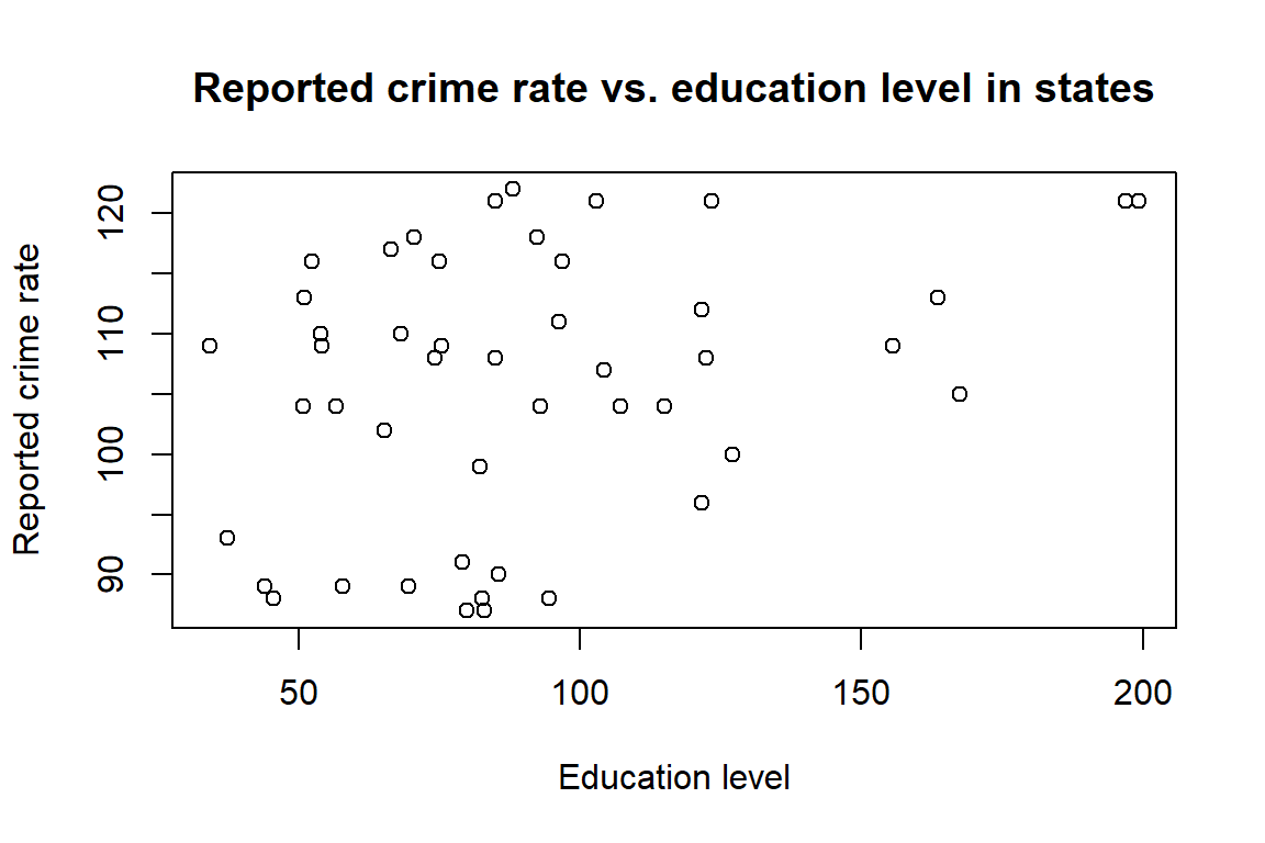
cor(dat.crime$R, dat.crime$Ed)## [1] 0.3228349Answer: The correlation is calculated to be 0.3228349. It is a positive correlation, which means the states with higher education level tend to be richer and have larger metropolitan areas. In these places, there tends to be more police patrolling in these areas and could result in more crime reporting. In lower educated states, there might be less polices which resulted in low reporting. The correlation is low, which might be a result impacted by unknown confounding variables that is not considered in this dataset.
Problem 3
Regress reported crime rate (y) on average education (x) and call this linear model crime.lm and write the summary of the regression by using this code, which makes it look a little nicer.
crime.lm <- lm(formula = R ~ Ed, data = dat.crime)
summary(crime.lm)
##
## Call:
## lm(formula = R ~ Ed, data = dat.crime)
##
## Residuals:
## Min 1Q Median 3Q Max
## -60.061 -27.125 -4.654 17.133 91.646
##
## Coefficients:
## Estimate Std. Error t value Pr(>|t|)
## (Intercept) -27.3967 51.8104 -0.529 0.5996
## Ed 1.1161 0.4878 2.288 0.0269 *
## ---
## Signif. codes: 0 '***' 0.001 '**' 0.01 '*' 0.05 '.' 0.1 ' ' 1
##
## Residual standard error: 37.01 on 45 degrees of freedom
## Multiple R-squared: 0.1042, Adjusted R-squared: 0.08432
## F-statistic: 5.236 on 1 and 45 DF, p-value: 0.02688Answer: the summary is demonstrated above.
Problem 4
Are the four assumptions of linear regression satisfied? To answer this, draw the relevant plots. (Write a maximum of one sentence per assumption.)
plot(dat.crime$Ed, crime.lm$residuals, main="Residuals vs. x", xlab="x, Education level", ylab="Residuals")
abline(h = 0, lty="dashed")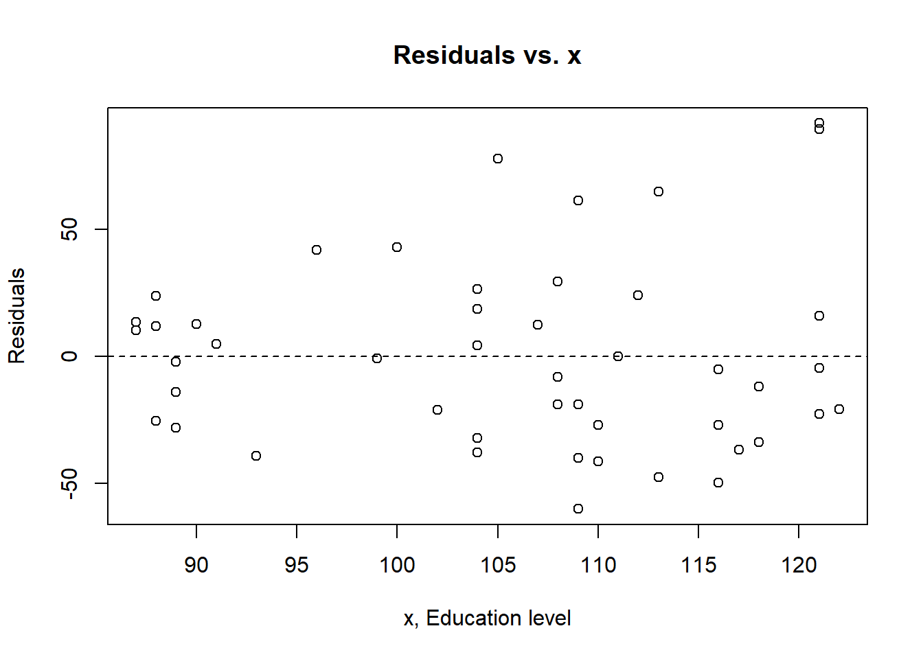
plot(crime.lm)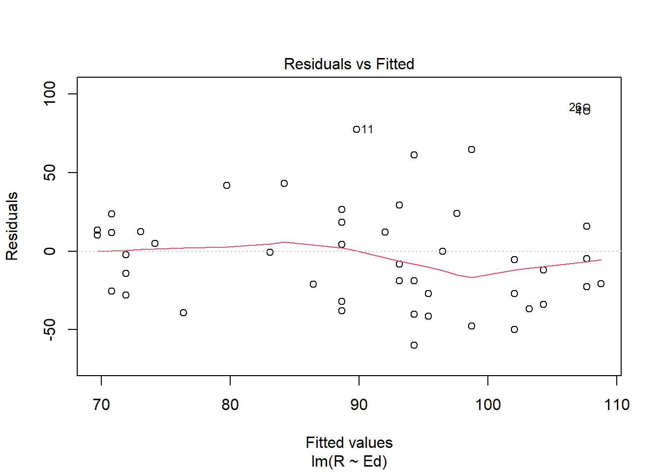
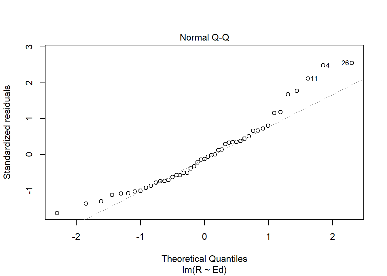
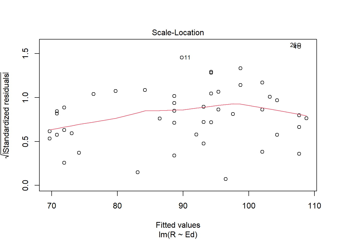
Answer: Linearity assumption is satisfied because there is no pattern observed in the residual vs. fitted plot and the line seems straight enough. The Independence assumption is satisfied because there seems to be no unique pattern in the residual vs. x plot. The homoscedasticity assumption is met because in the scale location plot, there is no significant pattern of the red line. The normal population assumption is met because in residual vs. leverage, all values are within cook distance of 0.5, and in Normal Q-Q plot, the data fitted well enough throughout the line despite some variance in both ends.
Problem 5
Is the relationship between reported crime and average education statistically significant? Report the estimated coefficient of the slope, the standard error, and the p-value. What does it mean for the relationship to be statistically significant?
Answer: The slope is 1.1161, the standard error is 0.4878, and the p value 0.0269. When the relationship is statistically significant, it is very unlikely for it to be occurred by chance. Since 0.0269 is less than 0.05, it is statistically significant.
Problem 6
How are reported crime and average education related? In other words, for every unit increase in average education, how does reported crime rate change (per million) per state?
Answer: The reported crime and average education is positively correlated. With the data having been observed, for every unit increase in average education, there is a increase of 1.1161 in reported crime rate with a p-value 0.0269.
Problem 7
Can you conclude that if individuals were to receive more education, then crime will be reported more often? Why or why not?
Answer: No we cannot conclude that. Although the data is strongly correlated with a p value of 0.0269, which means we reject the null that education level and reported crime rate has no relationship, we cannot prove causation from correlation. These data are not generated with random procedure in experiment, thus we cannot conclude the causation given by the question.
Exam 2
Instructions
Create a folder in your computer (a good place would be under Crim 250, Exams).
Download the dataset from the Canvas website (sim.data.csv) onto that folder, and save your Exam 2.Rmd file in the same folder.
Data description: This dataset provides (simulated) data about 200 police departments in one year. It contains information about the funding received by the department as well as incidents of police brutality. Suppose this dataset (sim.data.csv) was collected by researchers to answer this question: “Does having more funding in a police department lead to fewer incidents of police brutality?”
Codebook:
- funds: How much funding the police department received in that year in millions of dollars.
- po.brut: How many incidents of police brutality were reported by the department that year.
- po.dept.code: Police department code
Problem 1: EDA (10 points)
Describe the dataset and variables. Perform exploratory data analysis for the two variables of interest: funds and po.brut.
library(readr)
sim_data <- read_csv("C:/Users/Gluttonous Kangaroo/Desktop/Penn Works/CRIM 250/Exam/Exam 2/sim.data.csv")
dat <- read.csv(file = 'sim.data.csv')
summary(dat)
## po.dept.code funds po.brut
## Min. : 1.00 Min. :21.40 Min. : 0.00
## 1st Qu.: 50.75 1st Qu.:51.67 1st Qu.:14.00
## Median :100.50 Median :59.75 Median :19.00
## Mean :100.50 Mean :61.04 Mean :18.14
## 3rd Qu.:150.25 3rd Qu.:72.17 3rd Qu.:22.00
## Max. :200.00 Max. :99.70 Max. :29.00hist(dat$funds, main="Funds", xlab="Funds in millions of $", ylab="Frequency")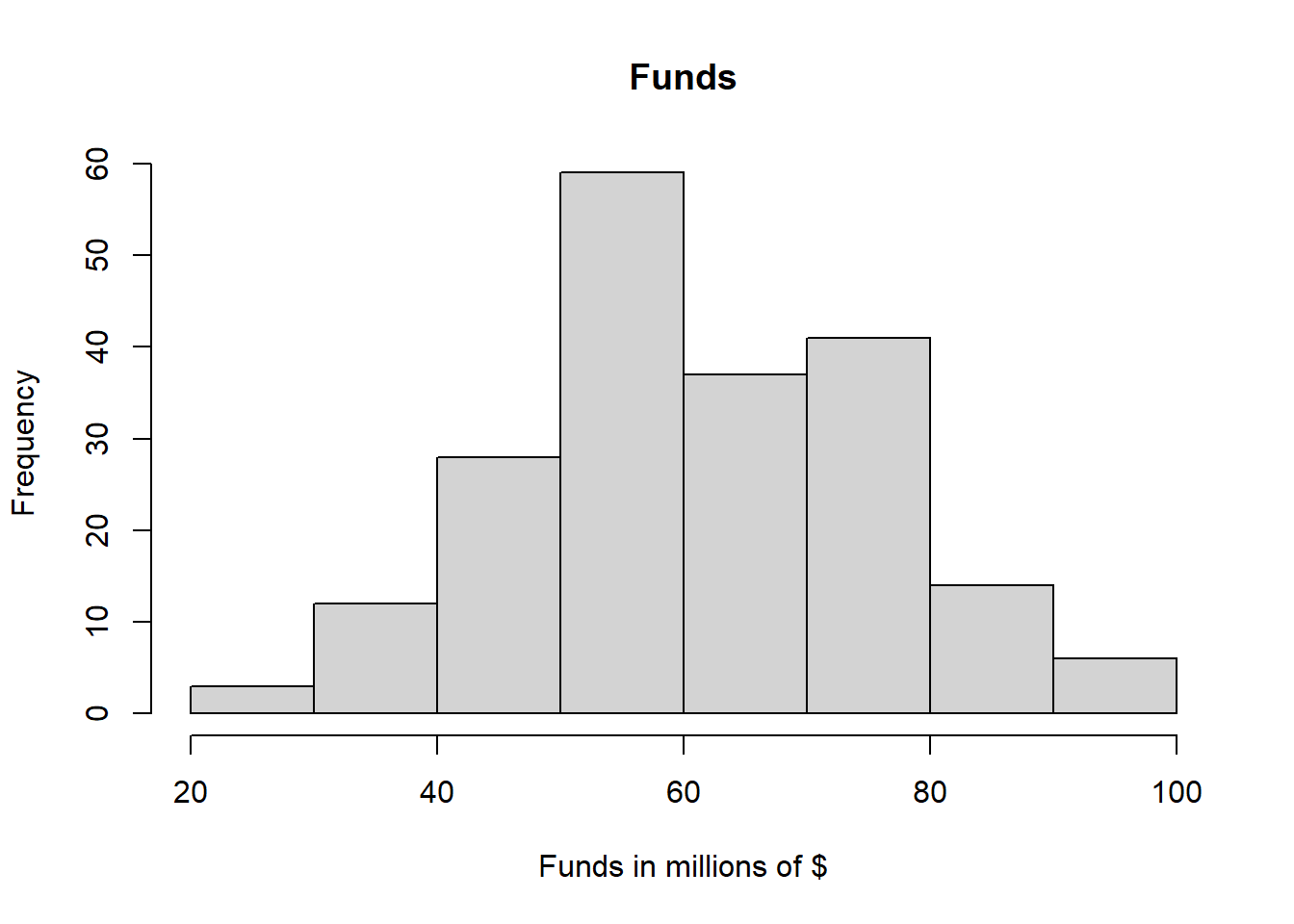
hist(dat$po.brut, main="Police Brutality", xlab="Police Brutality Incidents", ylab="Frequency")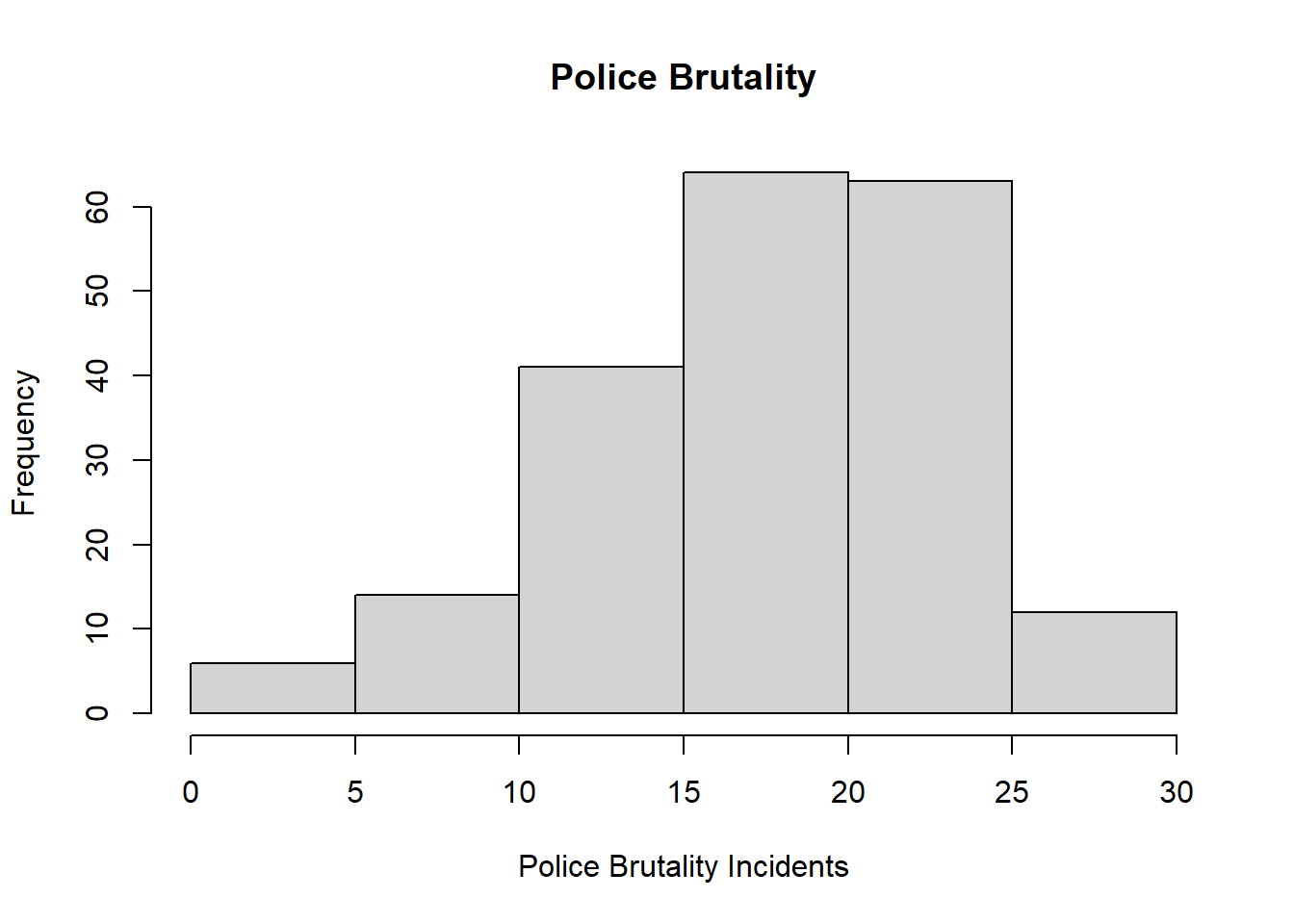
plot(dat$funds, dat$po.brut, xlab="Funds(in millions of $)", ylab="Police Brutality")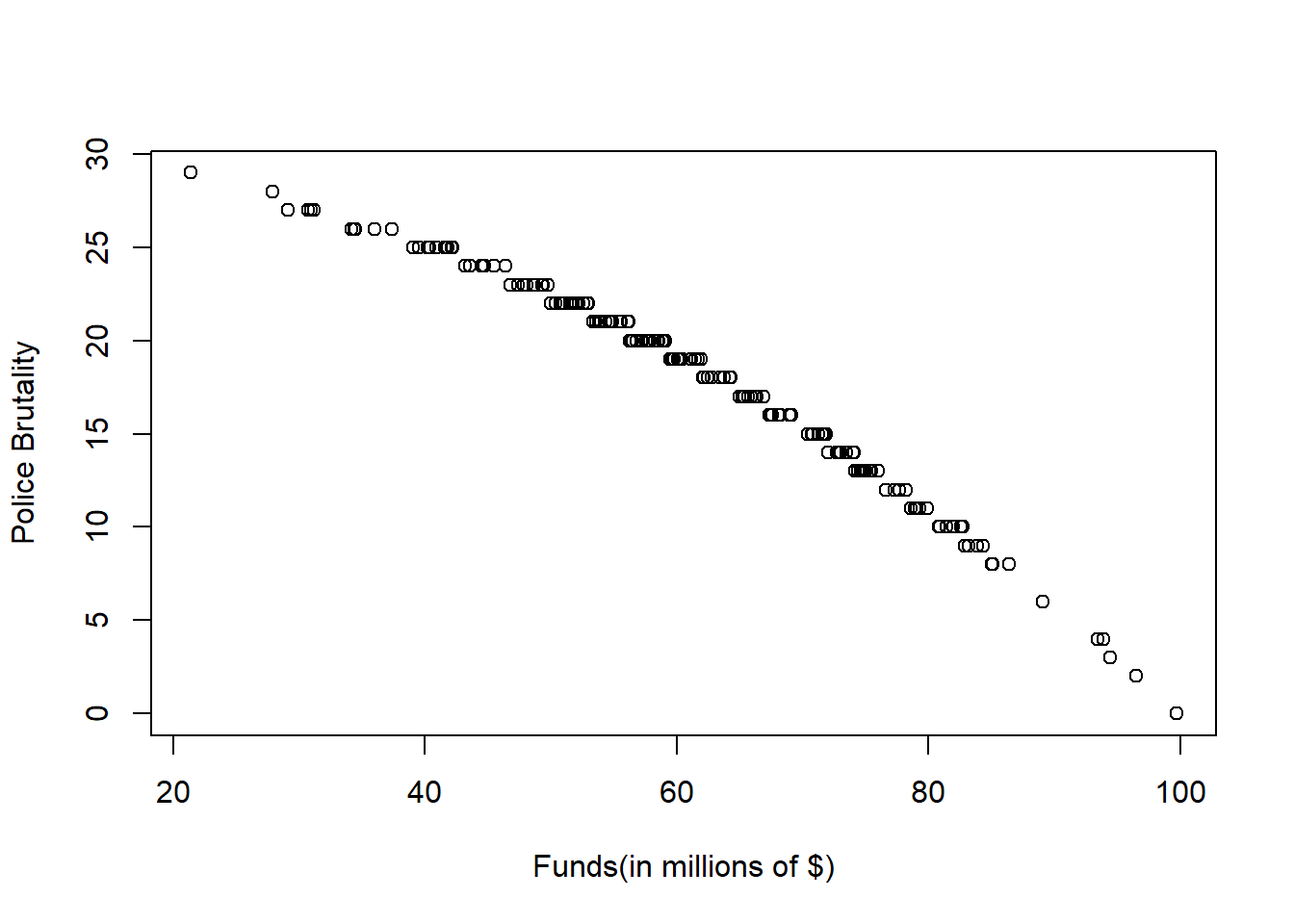
Answer: This dataset is a dataset that contain 200 observations of three variables.The variable funds has a mean of 61.04 and a median of 59.75. The variable po.brut has a mean of 18.14 and a median of 19.00. Since difference between the mean and the median is small, both variables are not greatly affected by extreme values. From the Histograms plotted, we can see that the funds distribution among the police department is unimodaland approximately normal with a peak at 50-60 millions of dollars. We can also see that the distribution of police brutality incidents is bimodal and skewed to the left with two peaks at 15-20 and 20-25. From the scatter plot, given the data, the police brutality seem to be decreasing in a concave down matter as the the funds of police departments increase.
Problem 2: Linear regression (30 points)
- Perform a simple linear regression to answer the question of interest. To do this, name your linear model “reg.output” and write the summary of the regression by using “summary(reg.output)”.
reg.output <- lm(formula = po.brut ~ funds, data = dat)
summary(reg.output)
##
## Call:
## lm(formula = po.brut ~ funds, data = dat)
##
## Residuals:
## Min 1Q Median 3Q Max
## -3.9433 -0.2233 0.2544 0.5952 1.1803
##
## Coefficients:
## Estimate Std. Error t value Pr(>|t|)
## (Intercept) 40.543069 0.282503 143.51 <2e-16 ***
## funds -0.367099 0.004496 -81.64 <2e-16 ***
## ---
## Signif. codes: 0 '***' 0.001 '**' 0.01 '*' 0.05 '.' 0.1 ' ' 1
##
## Residual standard error: 0.9464 on 198 degrees of freedom
## Multiple R-squared: 0.9712, Adjusted R-squared: 0.971
## F-statistic: 6666 on 1 and 198 DF, p-value: < 2.2e-16Answer: The summary is shown above.
- Report the estimated coefficient, standard error, and p-value of the slope. Is the relationship between funds and incidents statistically significant? Explain.
Answer: The estimated coefficient is -0.367099, the standard error is 0.04496, and the p-value is less than 2e-16.
- Draw a scatterplot of po.brut (y-axis) and funds (x-axis). Right below your plot command, use abline to draw the fitted regression line, like this:
plot(dat$funds, dat$po.brut, xlab="Funds(in millions of $)", ylab="Police Brutality")
abline(reg.output, col = "red", lwd=2)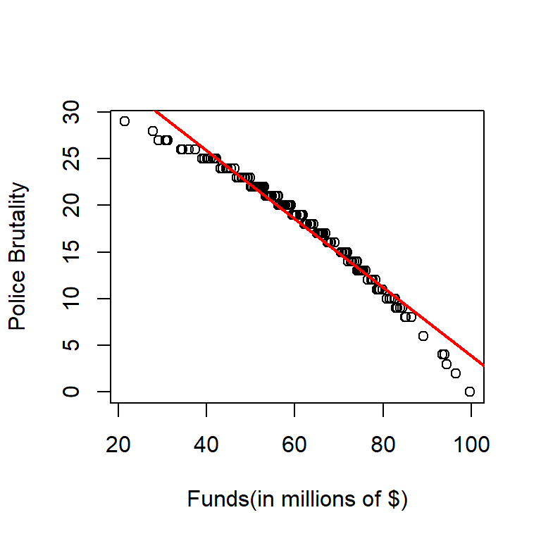 Does the line look like a good fit? Why or why not?
Answer: The line looks like a good fit because the pattern of the dots are decreasing for approximately the same slope as predicted by the fitted regression line for the majority of time. We can observe that there is a deviation from the fitted regression line from the two tails of the data, and the fact that both tails deviate to the same direction is concerning since that might be an indicator of a different relationship. However, without further analysis, the fitted line seems to be good because the deviation is small at the tails.
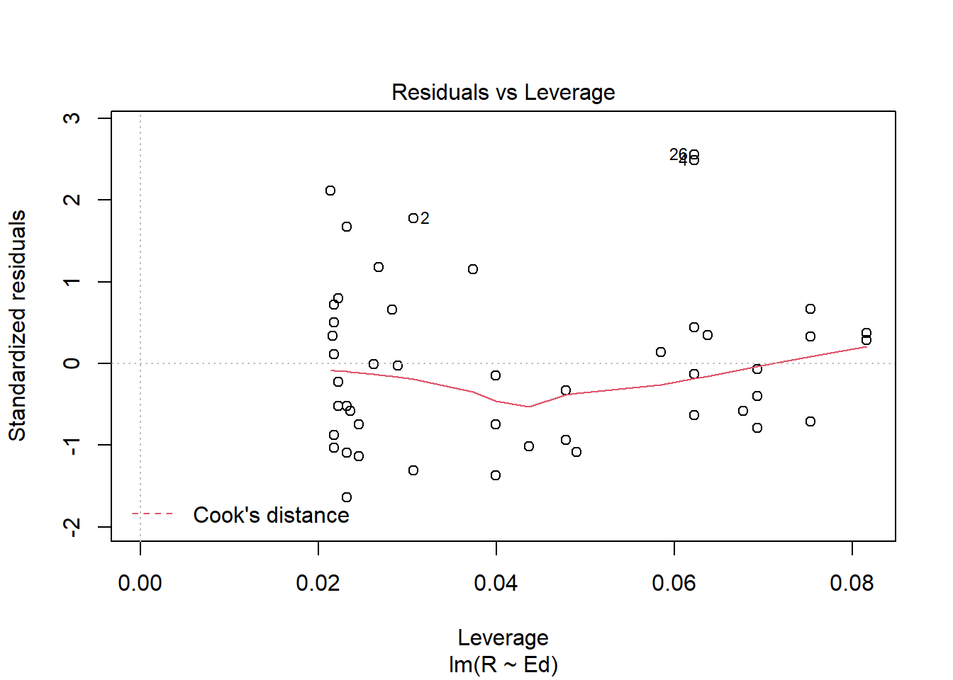
- Are the four assumptions of linear regression satisfied? To answer this, draw the relevant plots. (Write a maximum of one sentence per assumption.) If not, what might you try to do to improve this (if you had more time)?
plot(dat$funds, reg.output$residuals, main="Residuals vs. x", xlab="x, funds", ylab="Residuals")
abline(h = 0, lty="dashed")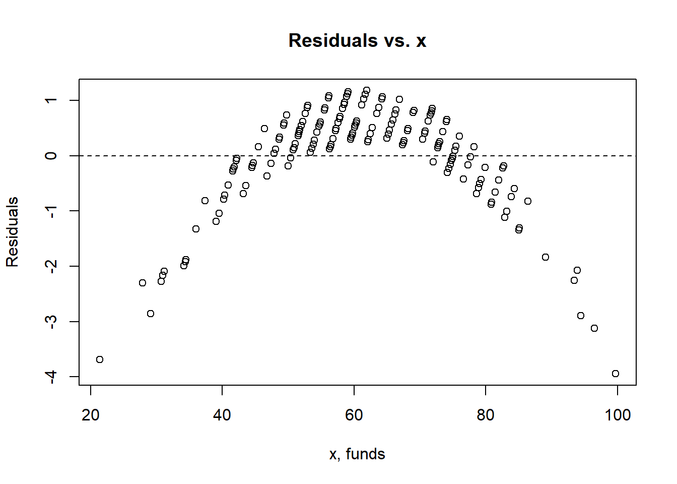
plot(reg.output)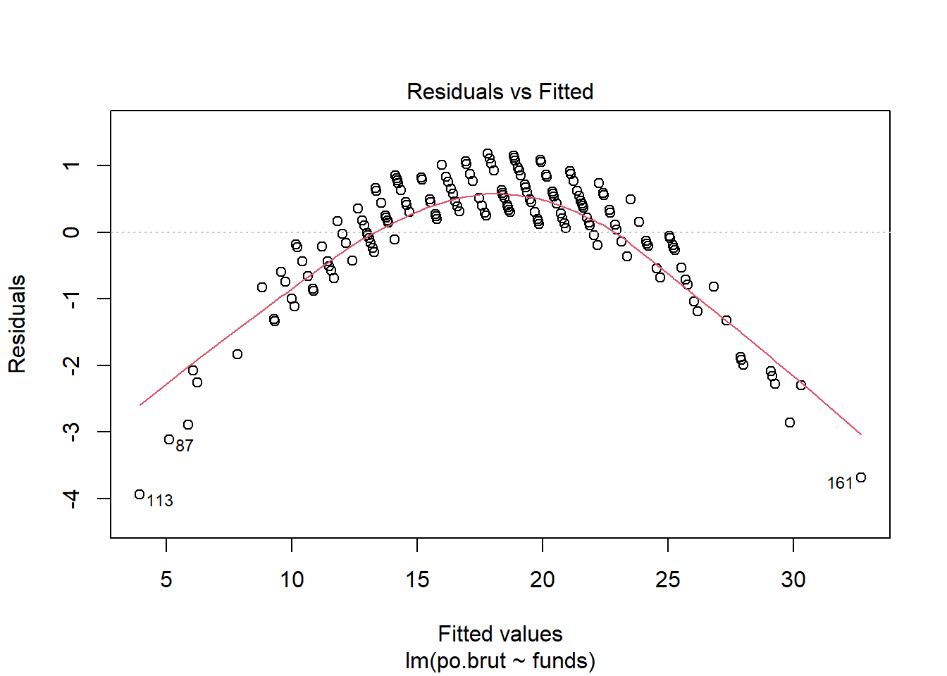
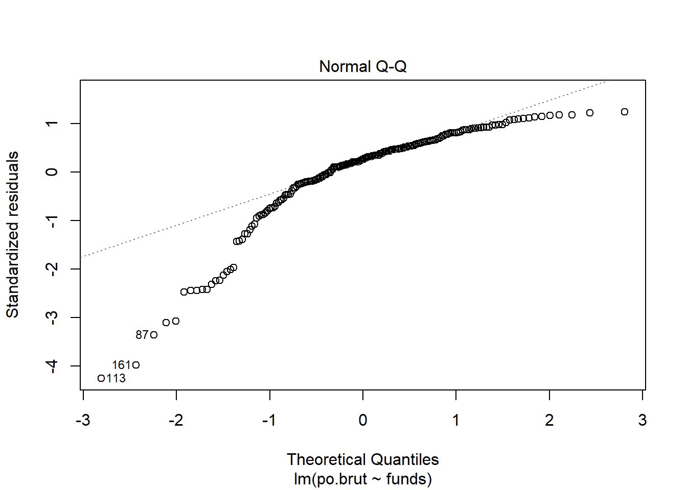
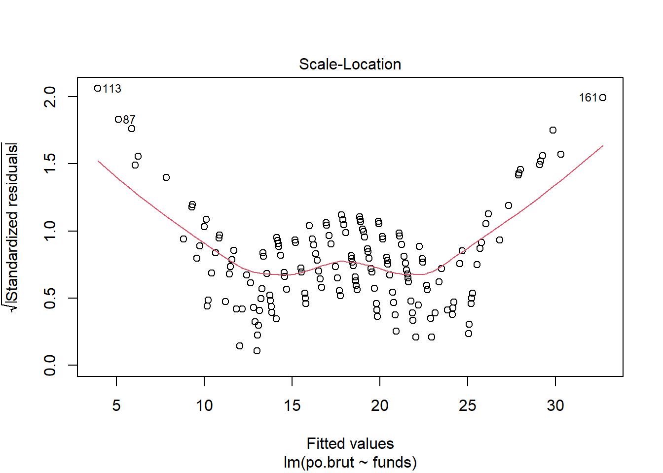
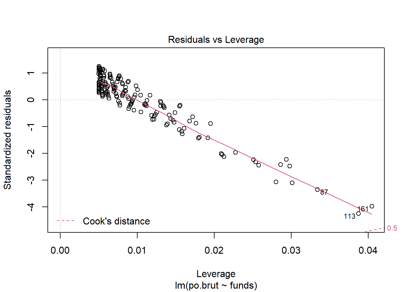
Answer: The Linearity assumption is not satisfied because there is a pattern observed in the residual vs. fitted plot and the line seems to be obviously concave down, stating the relationship might not be linear. The Independence assumption is not satisfied because there seems to be a pattern in the residual vs. x plot which is an obvious concave down curve, stating the data might not be independent, but it could also be due to the fitting of a bad model. The homoscedasticity assumption is not met because in the scale location plot, there is a significant pattern of the red line that is concave up curve, which means we cannot assume that the data have equal variance. The normal population assumption is barely met because in residual vs. leverage, all values are within cook distance of 0.5 and fitted the line quite well, but in Normal Q-Q plot, the data fitted not well throughout the line with a lot of variance in one end but not the other. The change can be made in transforming the data to log or exponential functions given there is a concavity in data.
- Answer the question of interest based on your analysis.
Answer: We are very confident that there is a strong association between the increasing of funding and the decreasing of police brutality incidents. However, since we have no available information of how the data is collected, especially it is not collected in experiment with parameters given, so it is hard for us to assert causality for this instance. It is potentially possible that a third variable like a policy implemented that could cause the change in both variables.
Problem 3: Data ethics (10 points)
Describe the dataset. Considering our lecture on data ethics, what concerns do you have about the dataset? Once you perform your analysis to answer the question of interest using this dataset, what concerns might you have about the results?
Answer: The dataset include Police Department Code, which can be used to track specific police department. Even if the code is not traceable for normal citizens, this is still sensitive information if people hacked into the system and decide to attack certain police departments with higher brutality incidents, which is a violation of confidentiality principle of data ethic. The results is also concerning since the data is collected by researchers with no further information given, which means it doesn’t provide enough transparency of how the data is collected, and there is a concern of fairness of whether there is biases given the data is clearly indicating a position.
Assignment 4
Exercise drawn from “R for Data Science”, Chapter 3 and 28=
Install ggplot
#install.packages("tidyverse")#
library(tidyverse)
Exercise 3.2.4
ggplot(data = mpg)
- Run ggplot(data = mpg). What do you see?
Answer: A blank sheet without dots.
- How many rows are in mpg? How many columns?
summary(mpg)## manufacturer model displ year
## Length:234 Length:234 Min. :1.600 Min. :1999
## Class :character Class :character 1st Qu.:2.400 1st Qu.:1999
## Mode :character Mode :character Median :3.300 Median :2004
## Mean :3.472 Mean :2004
## 3rd Qu.:4.600 3rd Qu.:2008
## Max. :7.000 Max. :2008
## cyl trans drv cty
## Min. :4.000 Length:234 Length:234 Min. : 9.00
## 1st Qu.:4.000 Class :character Class :character 1st Qu.:14.00
## Median :6.000 Mode :character Mode :character Median :17.00
## Mean :5.889 Mean :16.86
## 3rd Qu.:8.000 3rd Qu.:19.00
## Max. :8.000 Max. :35.00
## hwy fl class
## Min. :12.00 Length:234 Length:234
## 1st Qu.:18.00 Class :character Class :character
## Median :24.00 Mode :character Mode :character
## Mean :23.44
## 3rd Qu.:27.00
## Max. :44.00Answer: 234 rows and 11 columns.
- What does the drv variable describe? Read the help for ?mpg to find out.
#Use ?mpg #Answer: The type of drive train, where f = front-wheel drive, r = rear wheel drive, 4 = 4wd
- Make a scatterplot of hwy vs cyl.
ggplot(data = mpg) +
  geom_point(mapping = aes(x = hwy, y = cyl))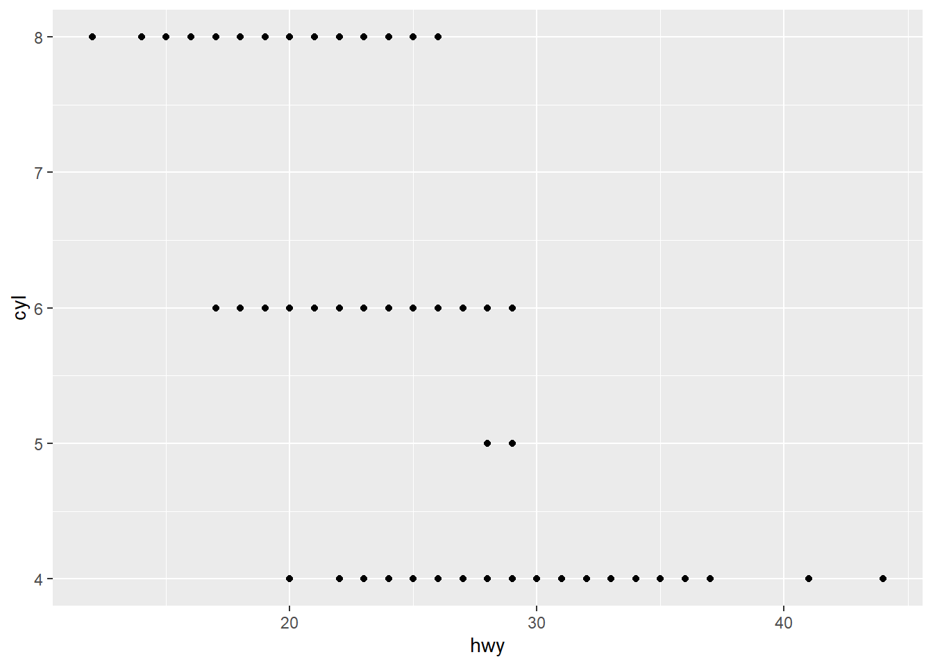
Answer: Plot is shown above.
- What happens if you make a scatterplot of class vs drv? Why is the plot not useful?
ggplot(data = mpg) +
  geom_point(mapping = aes(x = class, y = cyl))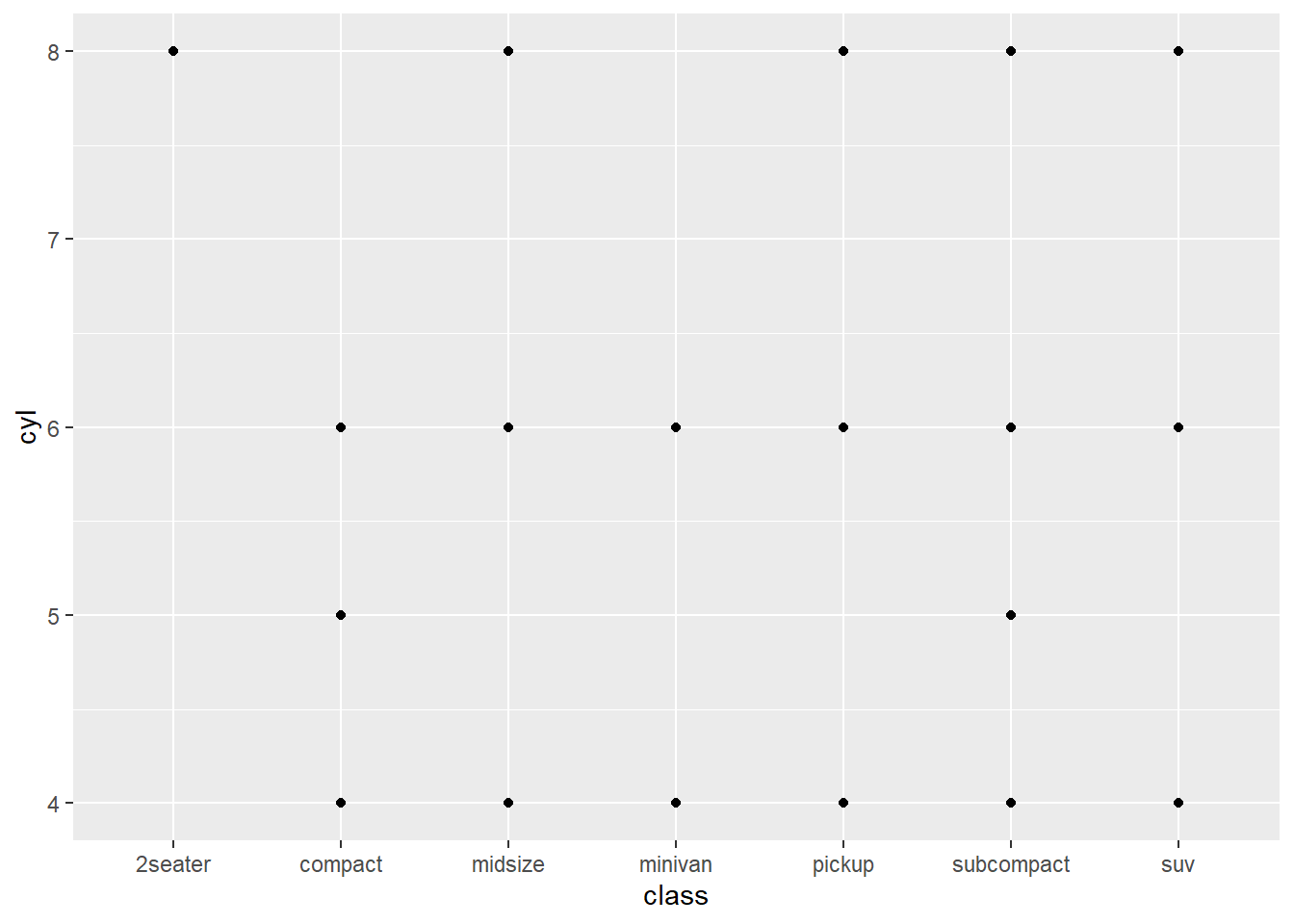
Answer: Result is shown above. The scatterplot is not useful mainly because class is a categorical variable.
Exercise 3.3.1
- What’s gone wrong with this code? Why are the points not blue?
ggplot(data = mpg) +
  geom_point(mapping = aes(x = displ, y = hwy, color = "blue"))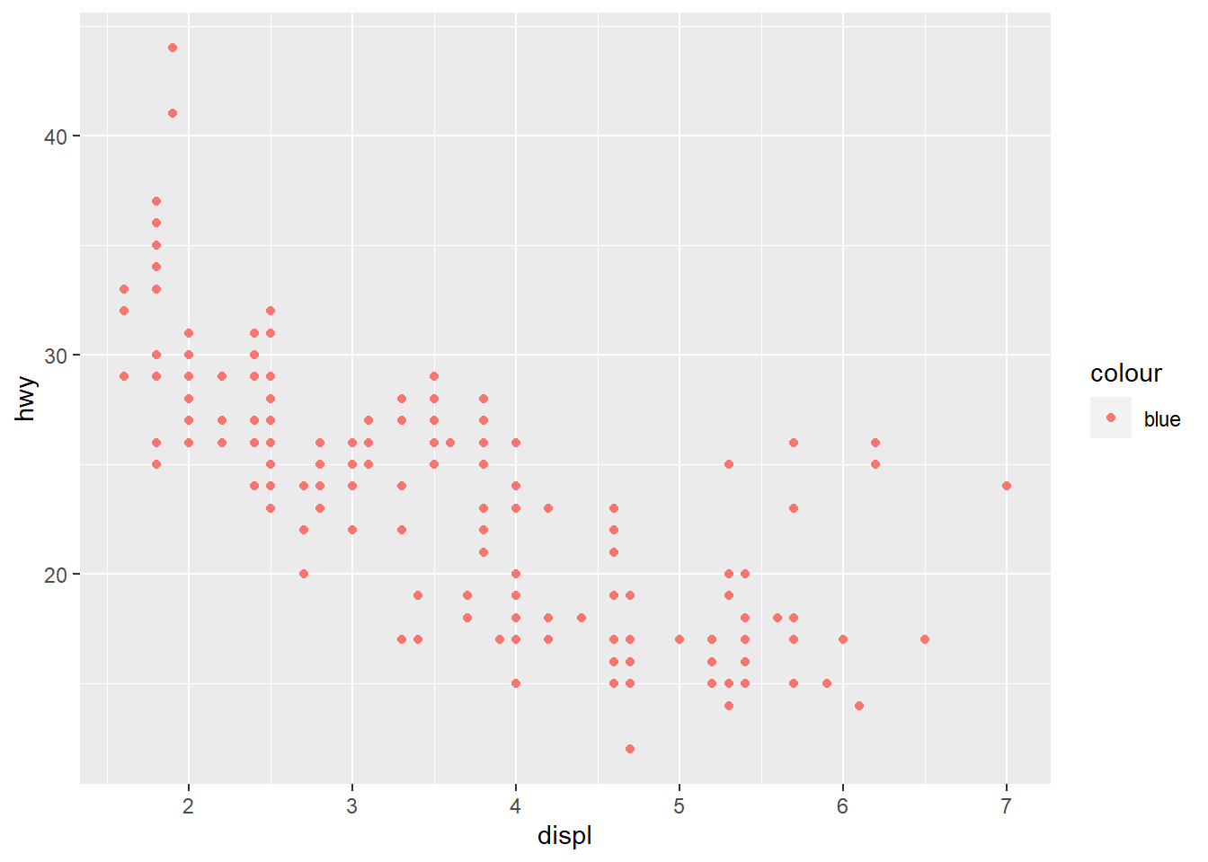
Answer: The paraphases is placed on the wrong position, it should be before the comma.
- Which variables in mpg are categorical? Which variables are continuous? (Hint: type ?mpg to read the documentation for the dataset). How can you see this information when you run mpg?
Answer: fl, drv, class, trans, model, manfucaturer are categorical. The rest is continous. Such information can be seen via ? of R.
- Map a continuous variable to color, size, and shape. How do these aesthetics behave differently for categorical vs. continuous variables?
ggplot(data = mpg) +
  geom_point(mapping = aes(x = displ, y = hwy, color = cyl))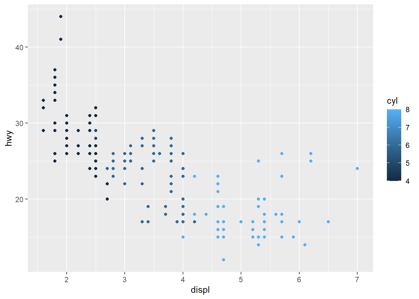
ggplot(data = mpg) +
  geom_point(mapping = aes(x = displ, y = hwy, size = cyl))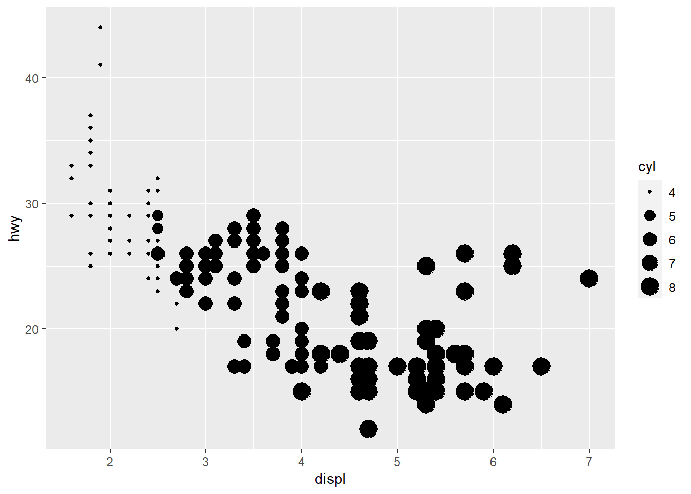
ggplot(data = mpg) +
  geom_point(mapping = aes(x = displ, y = hwy, alpha = cyl))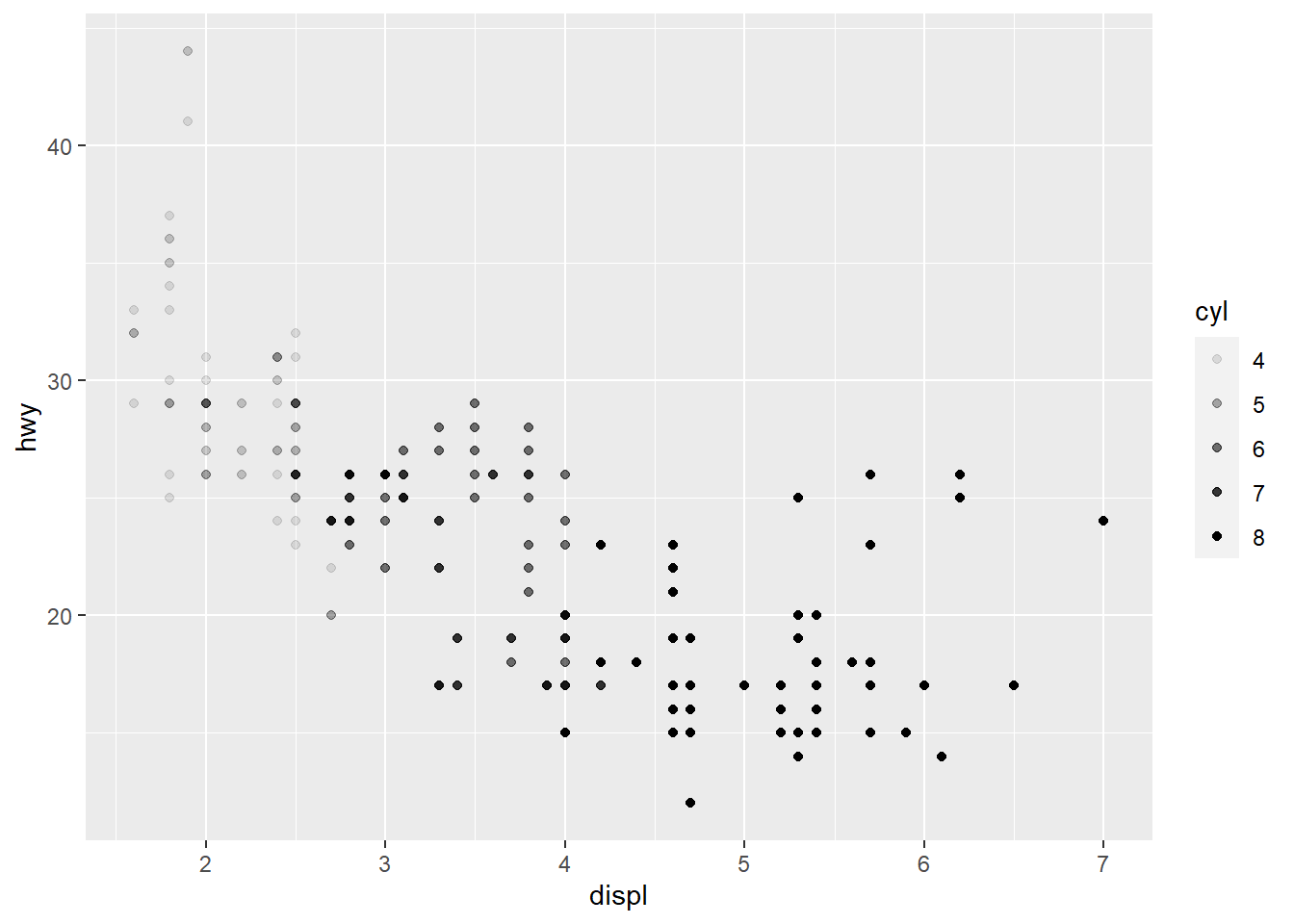
Answer: The color is plotted in a scale variation instead of discrete color categories. The shappe cannot be plotted for continous variable.
- What happens if you map the same variable to multiple aesthetics?
ggplot(data = mpg) +
geom_point(mapping = aes(x = displ, y = hwy, color = displ))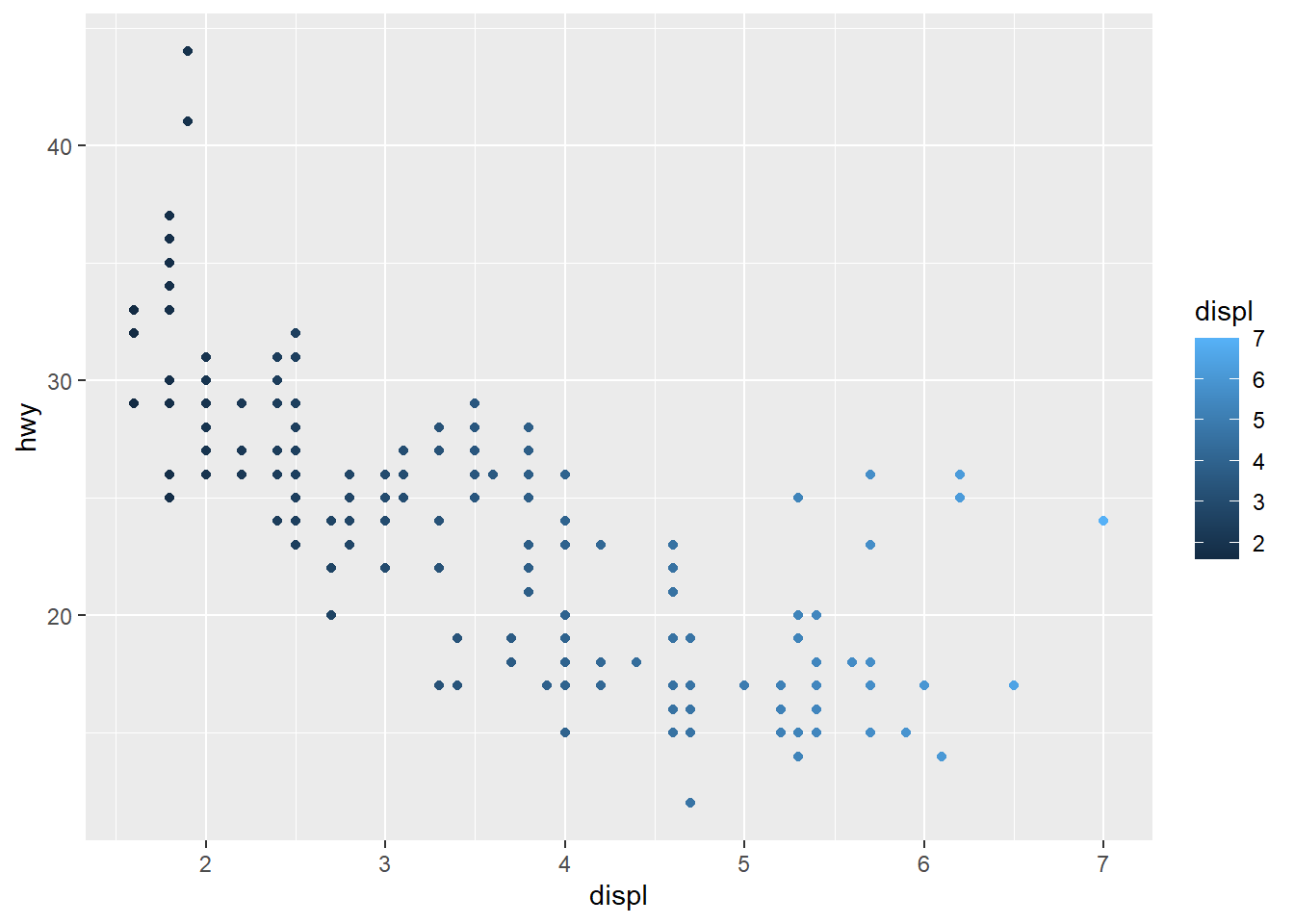 Answer: What will happen is shown above. The same variables behave in the same way.
- What does the stroke aesthetic do? What shapes does it work with? (Hint: use ?geom_point)
#Use ?geom_point#
vignette("ggplot2-specs")
Answer: Stroke aesthetic modify the width of the border. It work with circles.
What happens if you map an aesthetic to something other than a variable name, like aes(colour = displ < 5)? Note, you’ll also need to specify x and y.
ggplot(data = mpg) +
  geom_point(mapping = aes(x = displ, y = hwy, color = displ < 5))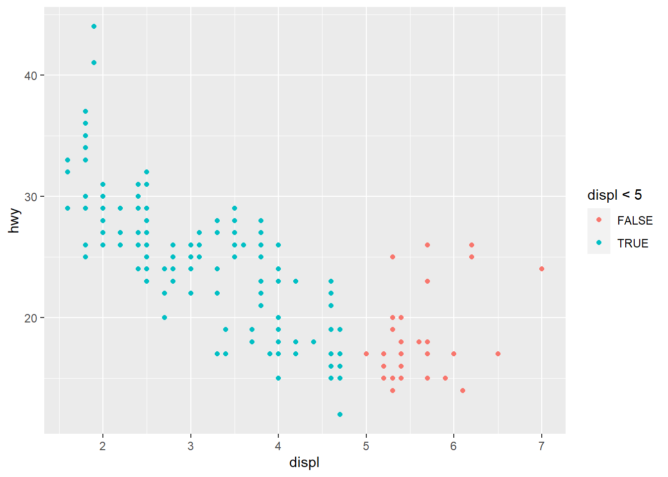
Answer: It will be shown as True/False value as shown above.
Exercise 3.5.1
- What happens if you facet on a continuous variable?
ggplot(data = mpg) +
  geom_point(mapping = aes(x = displ, y = hwy)) +
  facet_wrap(~ cty, nrow = 2)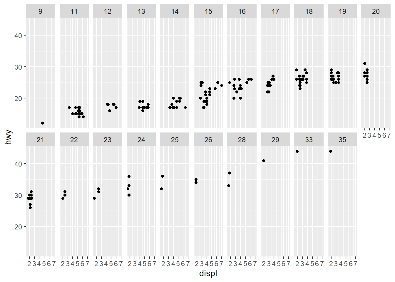
Answer: The data will make separate into many continuous parts.
- What do the empty cells in plot with facet_grid(drv ~ cyl) mean? How do they relate to this plot?
ggplot(data = mpg) +
  geom_point(mapping = aes(x = drv, y = cyl))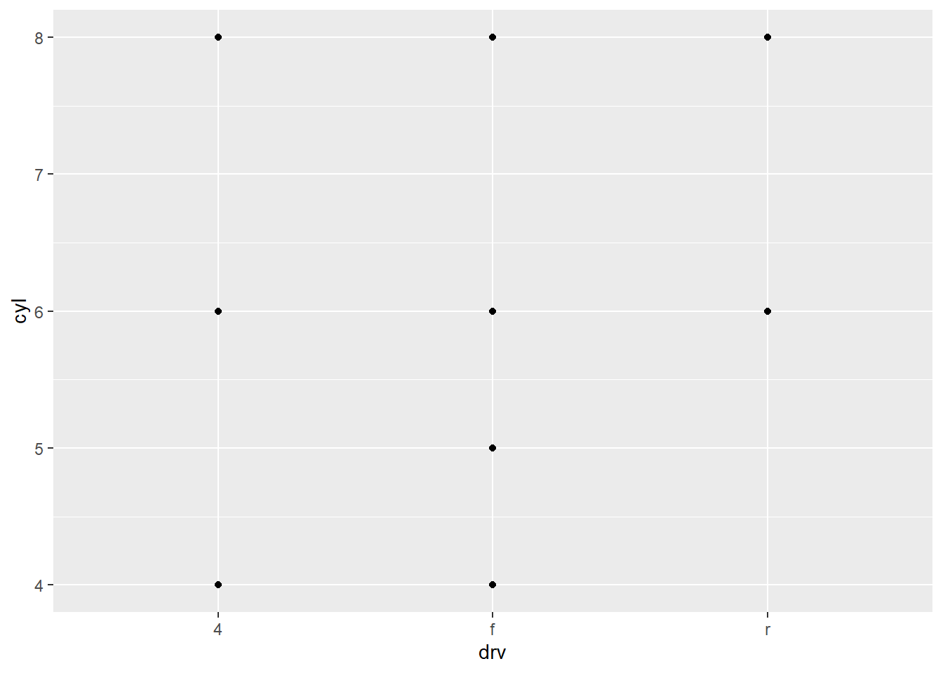
Answer: The empty cells mean that there is no data for that cell. It is related to the plot above because the place where there are no dots on the plot above is where the empty cells occur.
- What plots does the following code make? What does . do?
ggplot(data = mpg) +
  geom_point(mapping = aes(x = displ, y = hwy)) +
  facet_grid(drv ~ .)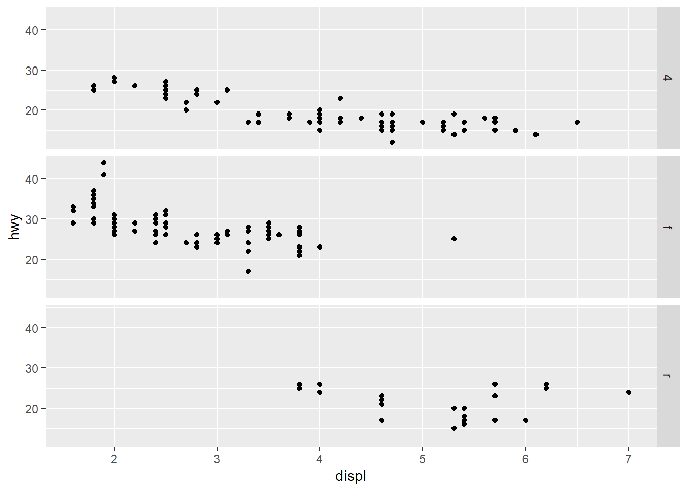
ggplot(data = mpg) +
  geom_point(mapping = aes(x = displ, y = hwy)) +
  facet_grid(. ~ cyl)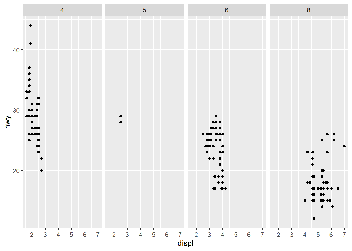
Answer: Facets. The . make disable one of the dimensions.
- Take the first faceted plot in this section:
ggplot(data = mpg) +
  geom_point(mapping = aes(x = displ, y = hwy)) +
  facet_wrap(~ class, nrow = 2)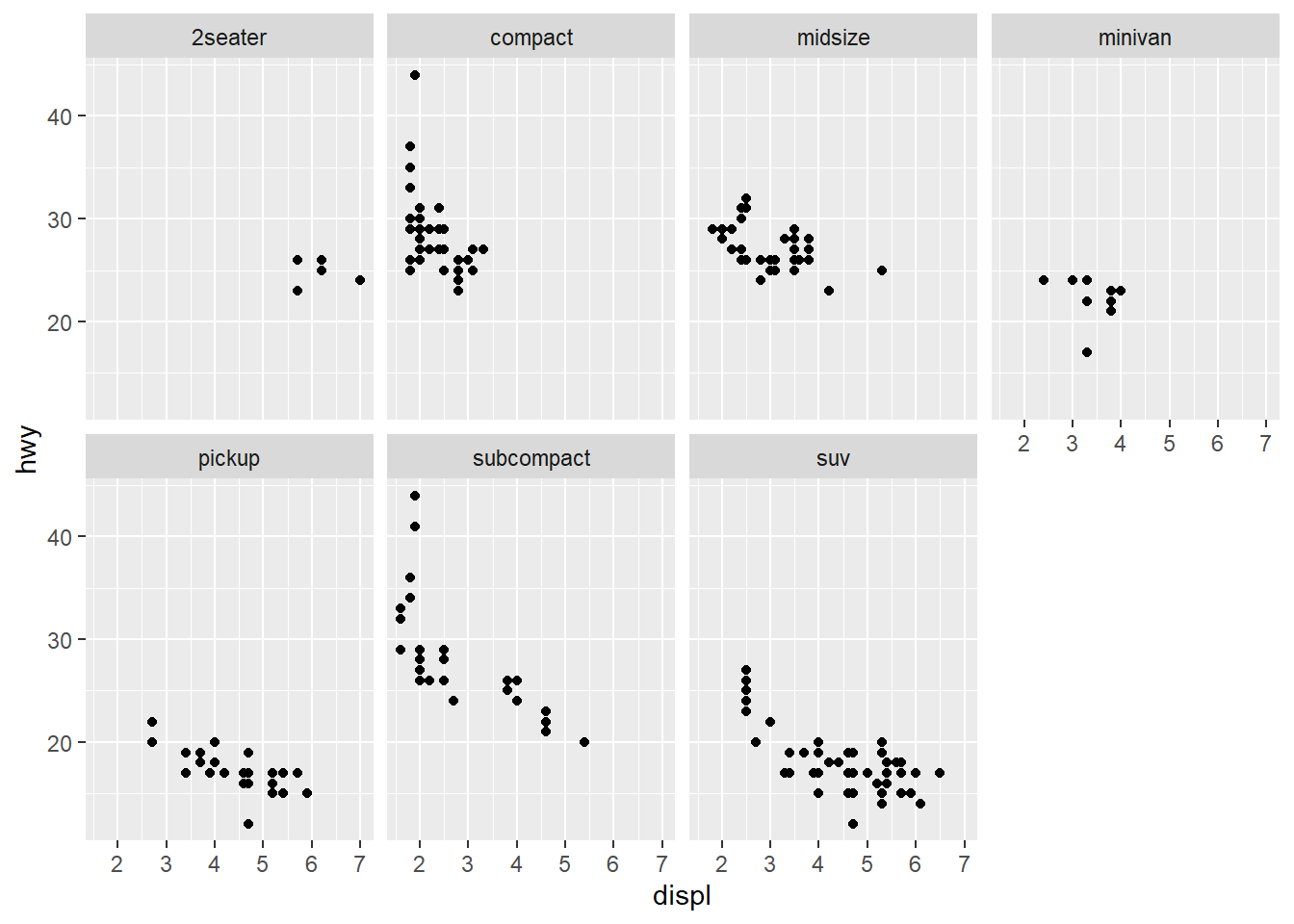
ggplot(data = mpg) +
geom_point(mapping = aes(x = displ, y = hwy, color = class))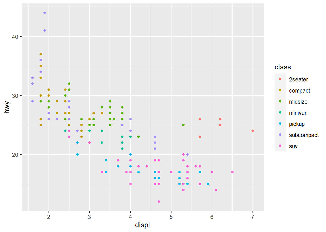 What are the advantages to using faceting instead of the colour aesthetic? What are the disadvantages? How might the balance change if you had a larger dataset?
Answer: Facet has advantage as it enable a complete and holistic comparison. The color aesthetic has the advantage of direct representation of the data. That is, the audience can understand color aesthetic easily. However, as the dataset gets larger, faceting become a better representation of the data.
- Read ?facet_wrap. What does nrow do? What does ncol do? What other options control the layout of the individual panels? Why doesn’t facet_grid() have nrow and ncol arguments?
#?facet_wrap#Answer: nrow and ncol set up the number of rows and columns. Scales also control the layout of the individual panels. The facet_grid() have no nrow and ncol because row and col in facet_grid() can be defined by formula, thus there should not be limitation for the numbers of rows and columns in facet_grid()
- When using facet_grid() you should usually put the variable with more unique levels in the columns. Why?
Answer: Because in that case the plot can be read easier by the audience.
Exercise 3.6.1
- What geom would you use to draw a line chart? A boxplot? A histogram? An area chart?
Answer: A line geom for a line chart, a box geom for a boxplot, a histogram geom for histogram, an area geom for area chart.
- Run this code in your head and predict what the output will look like. Then, run the code in R and check your predictions.
ggplot(data = mpg, mapping = aes(x = displ, y = hwy, color = drv)) +
  geom_point() +
  geom_smooth(se = FALSE)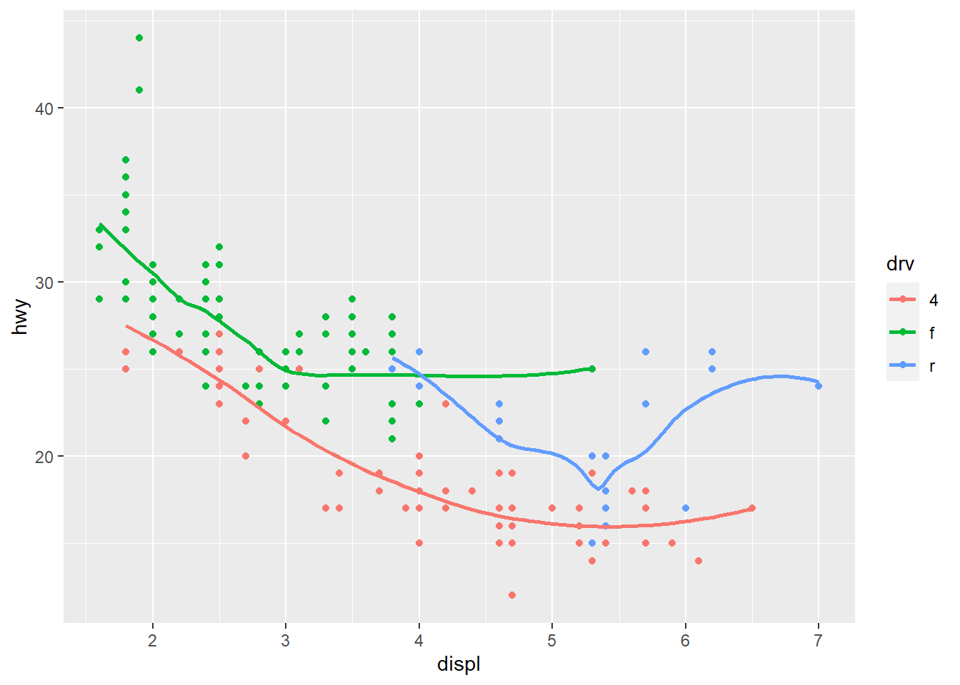
Answer: The output will plot hwy against displ, using drv as color aethestic, and the data are represented in points with smooth line.
- What does show.legend = FALSE do? What happens if you remove it? Why do you think I used it earlier in the chapter?
Answer: Show. legend = FALSE remove legend of the plot. If it is removed, then legend of the plot will be shown. This is added to avoid the auto generated legends.
- What does the se argument to geom_smooth() do?
#?geom_smooth#Answer: Se argument display confidence interval around smooth.
- Will these two graphs look different? Why/why not?
ggplot(data = mpg, mapping = aes(x = displ, y = hwy)) +
  geom_point() +
  geom_smooth()
ggplot() +
  geom_point(data = mpg, mapping = aes(x = displ, y = hwy)) +
  geom_smooth(data = mpg, mapping = aes(x = displ, y = hwy))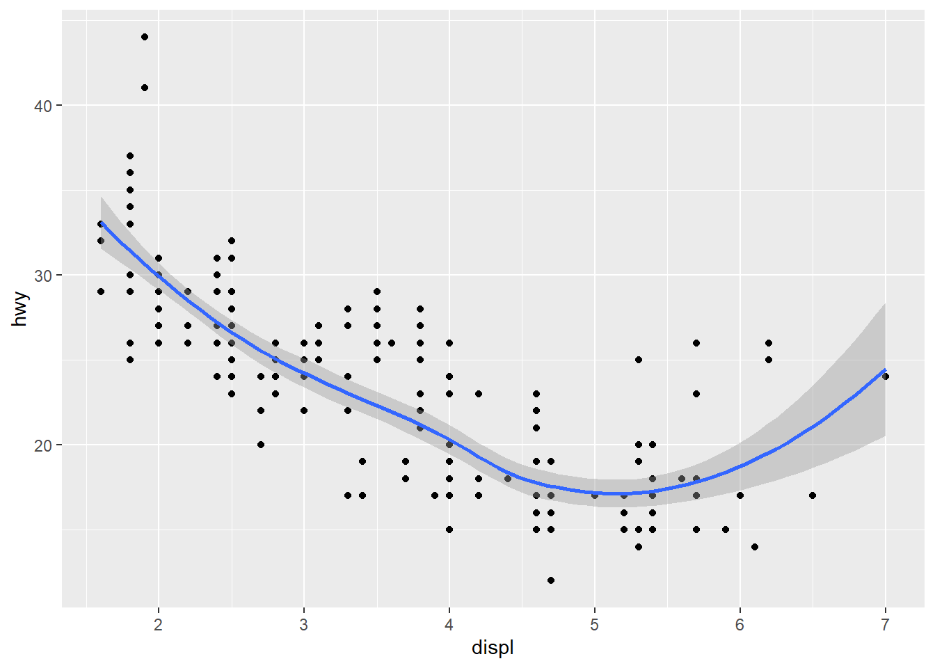
Answer: They look the same. They are the same because they put the same argument in the different places, which achieve the same result.
- Recreate the R code necessary to generate the following graphs.
ggplot() +
  geom_point(data = mpg, mapping = aes(x = displ, y = hwy)) +
  geom_smooth(data = mpg, mapping = aes(x = displ, y = hwy))
ggplot() +
  geom_point(data = mpg, mapping = aes(x = displ, y = hwy)) +
  geom_smooth(data = mpg, mapping = aes(x = displ, y = hwy, group = drv))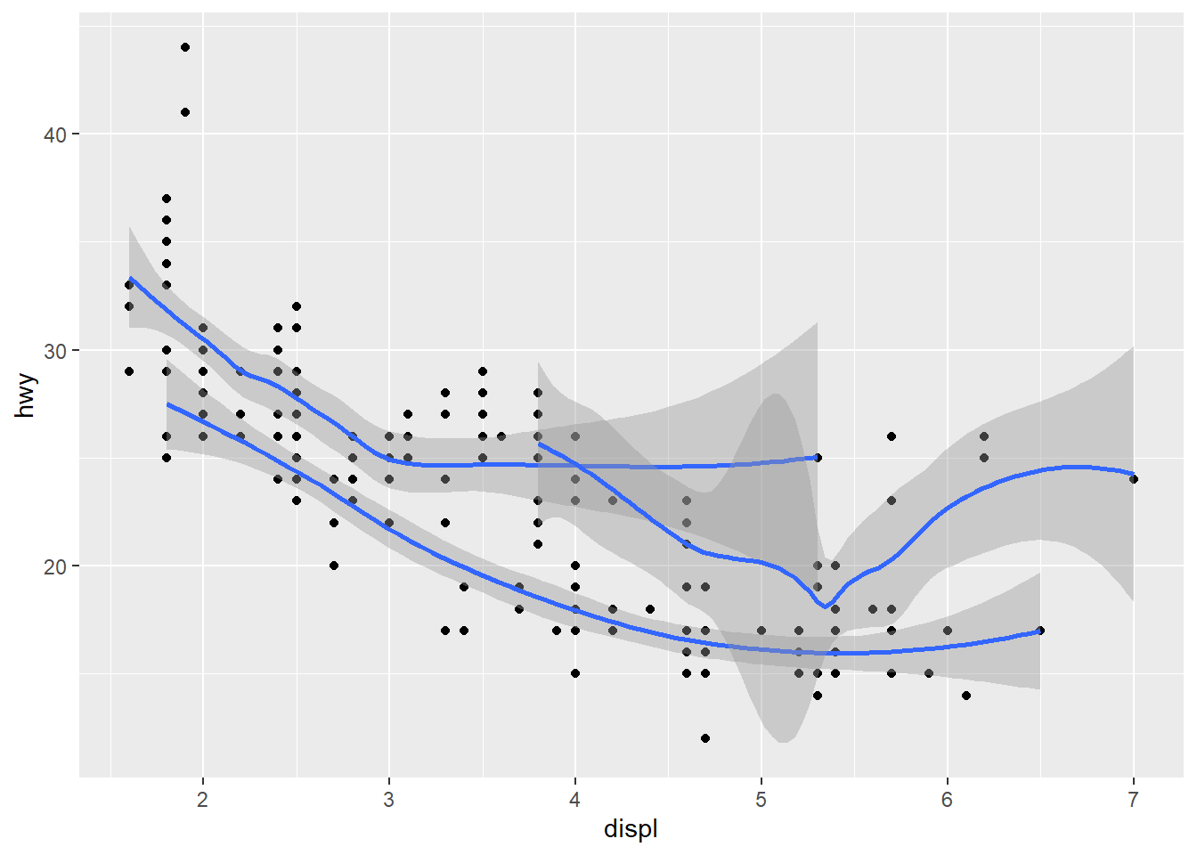
ggplot() +
  geom_point(data = mpg, mapping = aes(x = displ, y = hwy, color = drv)) +
  geom_smooth(data = mpg, mapping = aes(x = displ, y = hwy, color = drv))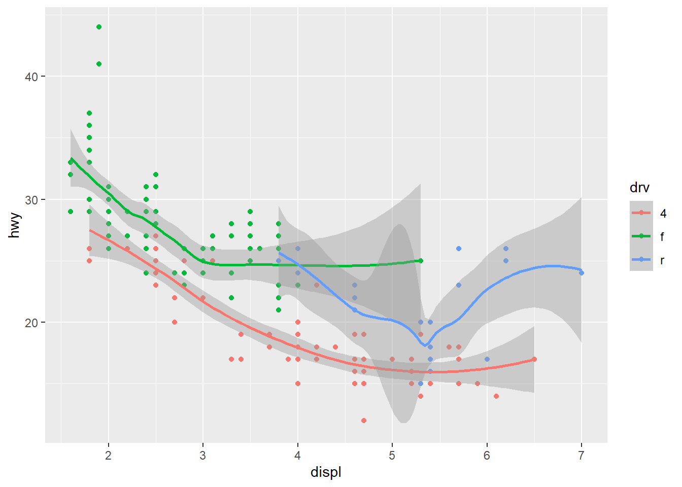
ggplot() +
  geom_point(data = mpg, mapping = aes(x = displ, y = hwy, color = drv)) +
  geom_smooth(data = mpg, mapping = aes(x = displ, y = hwy))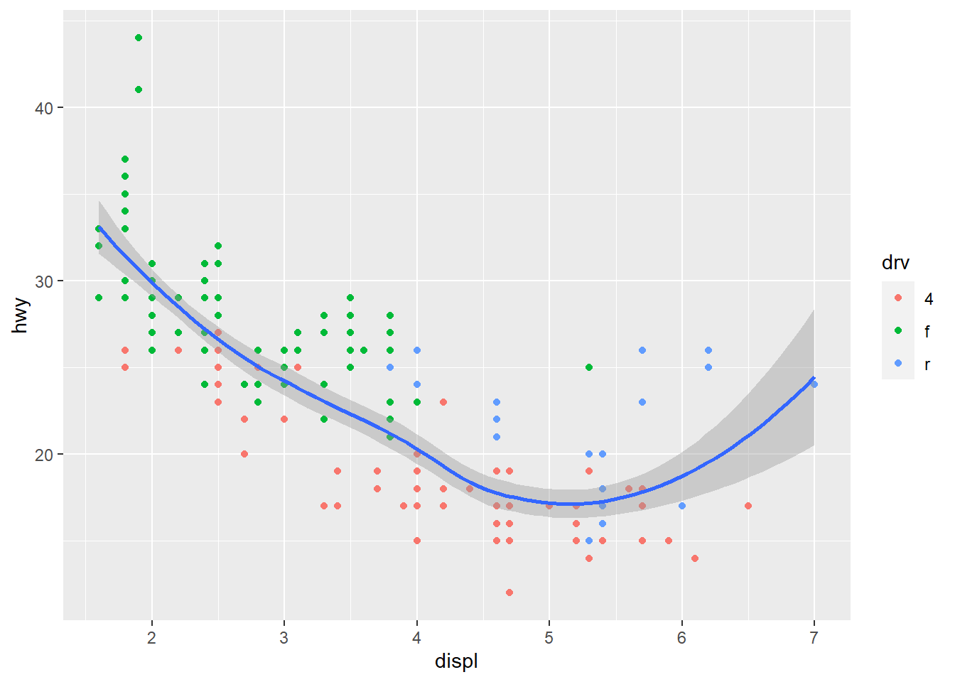
ggplot() +
  geom_point(data = mpg, mapping = aes(x = displ, y = hwy, color = drv)) +
  geom_smooth(data = mpg, mapping = aes(x = displ, y = hwy, group = drv))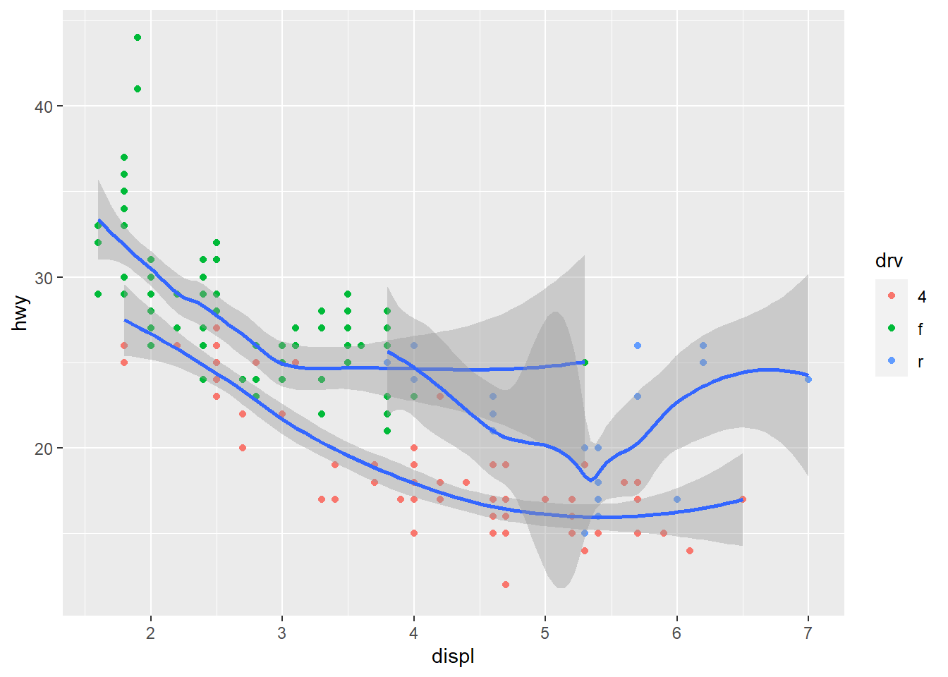
ggplot() +
  geom_point(data = mpg, mapping = aes(x = displ, y = hwy, color = drv))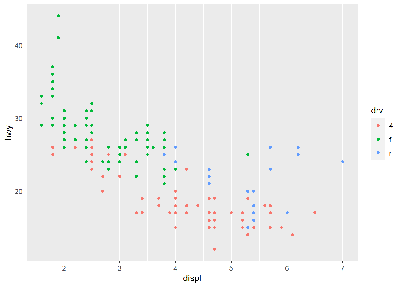
Answer: See plot above.
Exercise 3.7.1
- What is the default geom associated with stat_summary()? How could you rewrite the previous plot to use that geom function instead of the stat function?
#?stat_summary#Answer: The default geom is pointrange. It can be rewritten via geom argument.
- What does geom_col() do? How is it different to geom_bar()?
#?geom_col#Answer: geom_col() create bar chart. It is different from geom_bar() as geom_bar() makes the height of the bar proportional to the number of cases in each group, but geom_col() usesthe heights of the bars to represent values in the data.
- Most geoms and stats come in pairs that are almost always used in concert. Read through the documentation and make a list of all the pairs. What do they have in common?
Answer:The list can be found via typing geom_ and stat_. They serve the same function.
- What variables does stat_smooth() compute? What parameters control its behaviour?
#?stat_smooth#Answer: It compute a line that aids the eye in seeing patterns in the presence of overplotting. The span, level, and n control its behavior.
- In our proportion bar chart, we need to set group = 1. Why? In other words what is the problem with these two graphs?
ggplot(data = diamonds) +
  geom_bar(mapping = aes(x = cut, y = after_stat(prop)))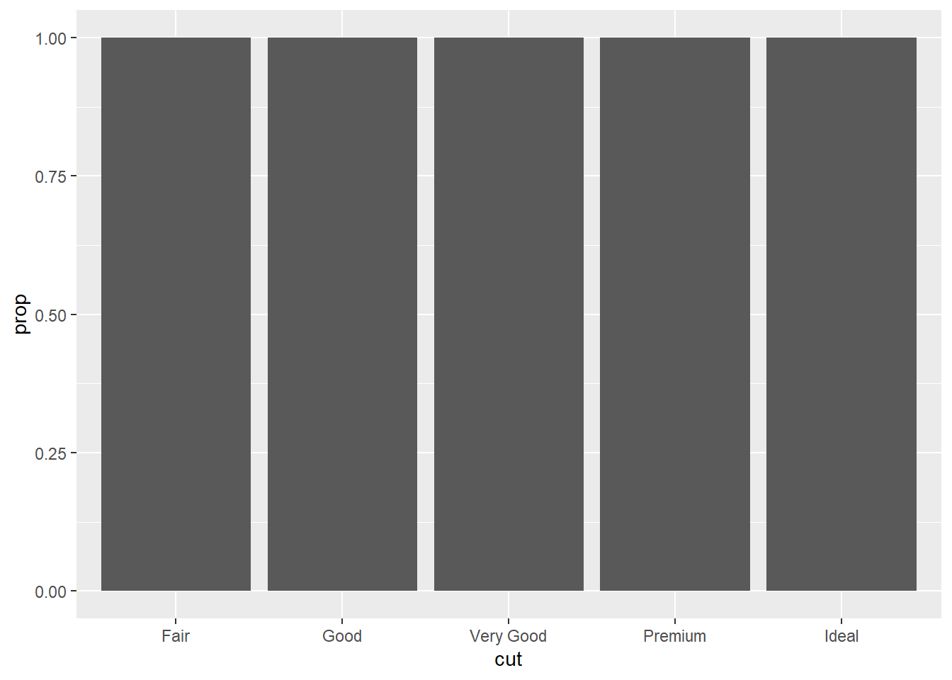
ggplot(data = diamonds) +
  geom_bar(mapping = aes(x = cut, fill = color, y = after_stat(prop)))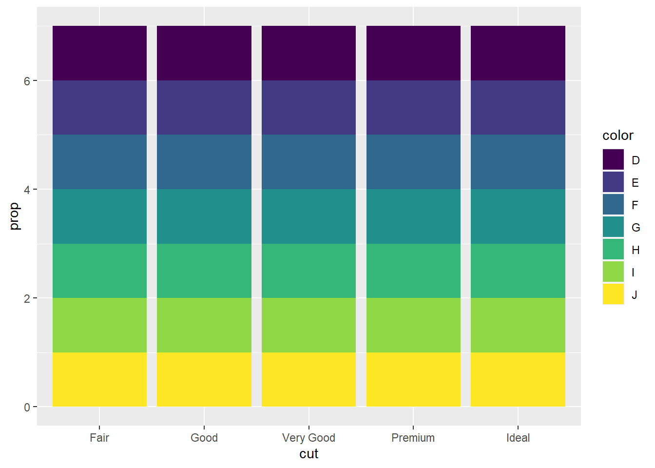
Answer: We cannot observe any pattern due to the poor setup.
Exercise 3.8.1
- What is the problem with this plot? How could you improve it?
ggplot(data = mpg, mapping = aes(x = cty, y = hwy)) +
  geom_point()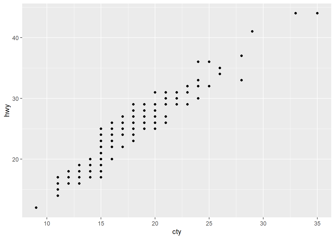
Answer: The problem is overplotting. It can be improved through jitter in position.
- What parameters to geom_jitter() control the amount of jittering?
#?geom_jitter#Answer: The parameter of the amount of jittering is width and height.
- Compare and contrast geom_jitter() with geom_count().
#?geom_count#Answer: Both geom deal with over plotting, but geom_count counts the number of observations at each location, then maps the count to point area, whereas geom_jitter add small random noise to the data.
- What’s the default position adjustment for geom_boxplot()? Create a visualisation of the mpg dataset that demonstrates it.
ggplot(data = mpg) +
  geom_boxplot(mapping = aes(x = displ, y = hwy))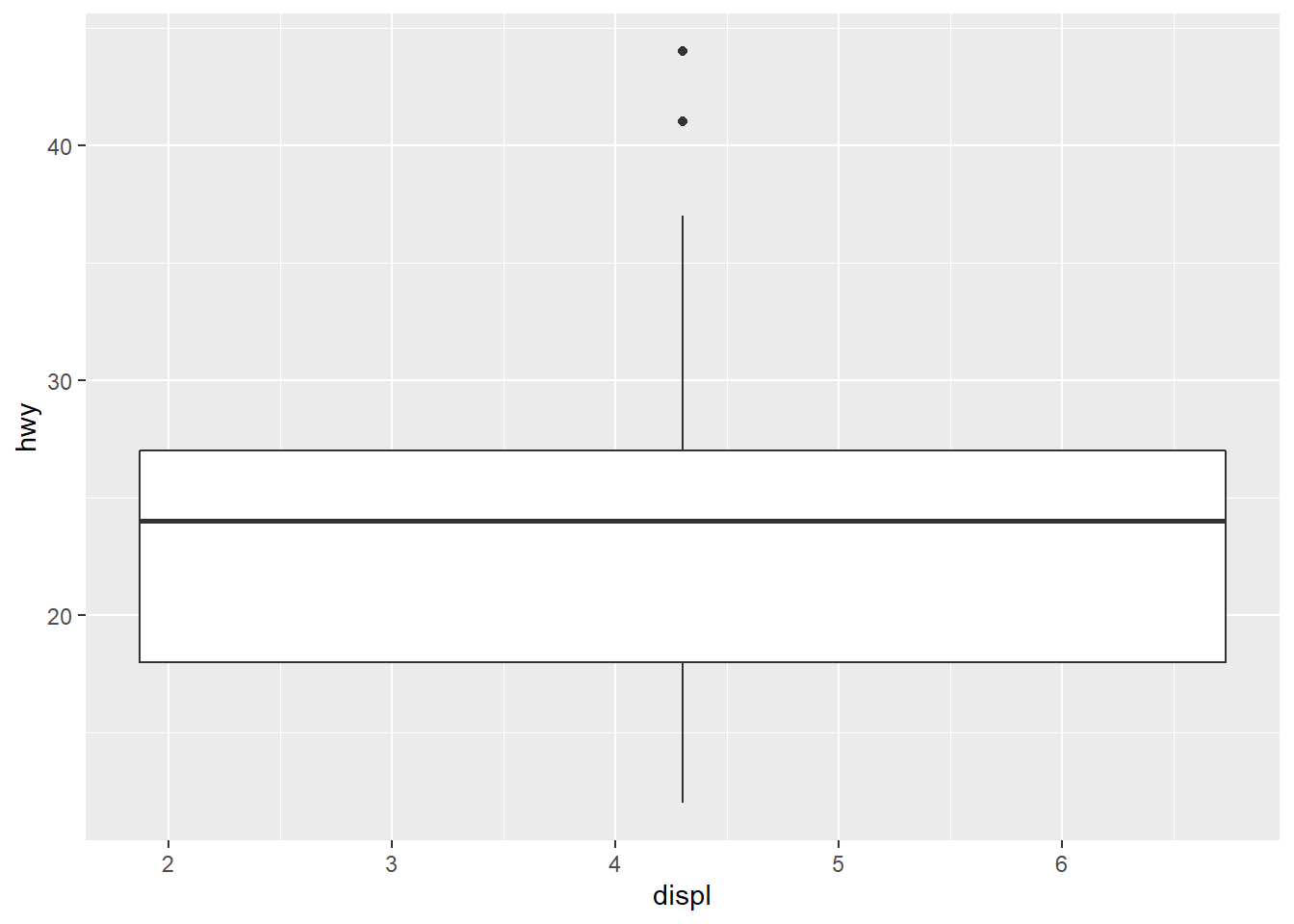
Answer: As demonstrated, geom_box use dodge2 as default position.
Exercise 3.9.1
- Turn a stacked bar chart into a pie chart using coord_polar().
bar <- ggplot(data = mpg, aes(fill=class, y=drv, x=hwy)) +
    geom_bar(position="stack", stat="identity")
bar + coord_polar()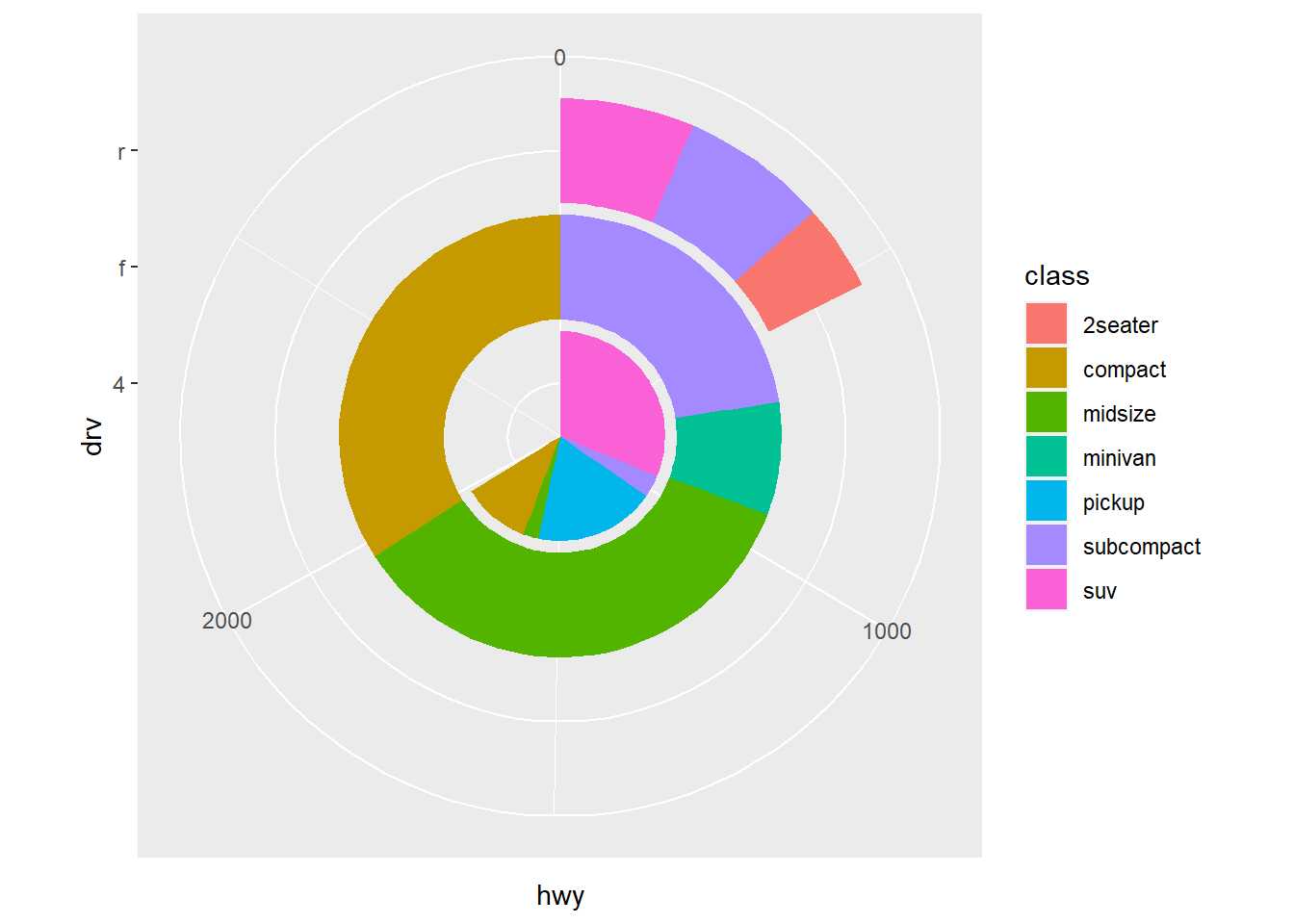
Answer: See plot above
- What does labs() do? Read the documentation.
#?labs#Answer: It can modify plot labels.
- What’s the difference between coord_quickmap() and coord_map()?
#?coord_map#Answer: Coord_map can set parameters but coord_quickmap cannot.
- What does the plot below tell you about the relationship between city and highway mpg? Why is coord_fixed() important? What does geom_abline() do?
ggplot(data = mpg, mapping = aes(x = cty, y = hwy)) +
  geom_point() +
  geom_abline() +
  coord_fixed()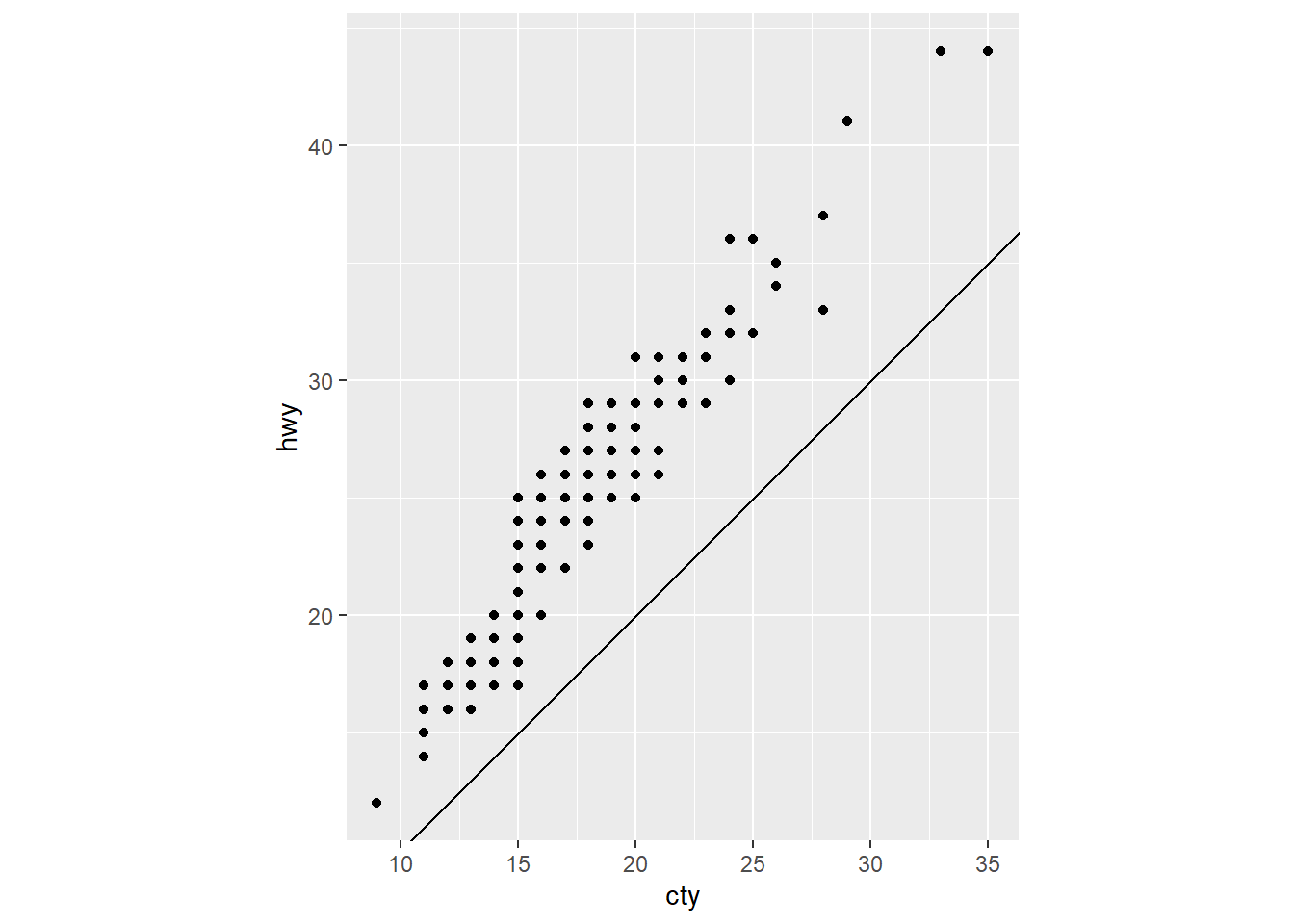
Answer: The relationship between highway and city is linear. Coord_fixed is important beacause it force a sepcific ration into the plot. Geom_abline() compute the line.
Exercise 28.2.1
- Create one plot on the fuel economy data with customised title, subtitle, caption, x, y, and colour labels.
ggplot(mpg, aes(fl, hwy)) +
  geom_point(aes(colour = class)) +
  geom_smooth(se = FALSE) +
  labs(
    x = "FUEL TYPE (mpg)",
    y = "Highway fuel economy (mpg)",
    colour = "Car type")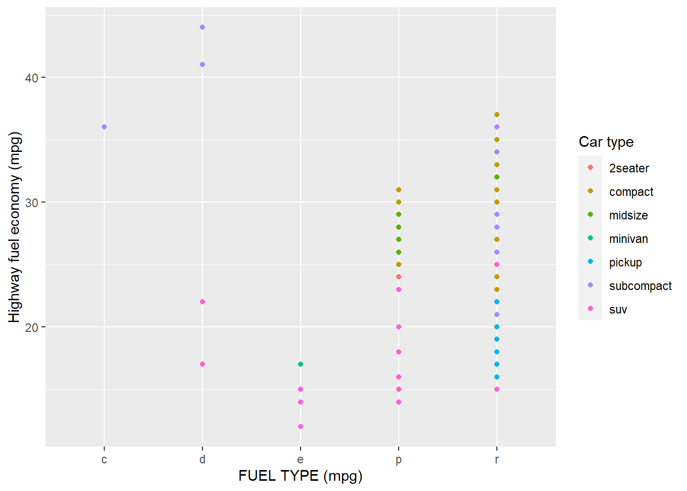
Answer: See plot above.
- The geom_smooth() is somewhat misleading because the hwy for large engines is skewed upwards due to the inclusion of lightweight sports cars with big engines. Use your modelling tools to fit and display a better model.
ggplot(mpg, aes(displ, hwy), position = "identity") +
geom_point(aes(colour = class)) +
geom_smooth(se = FALSE) +
labs(
x = "Engine displacement (L)",
y = "Highway fuel economy (mpg)",
colour = "Car type")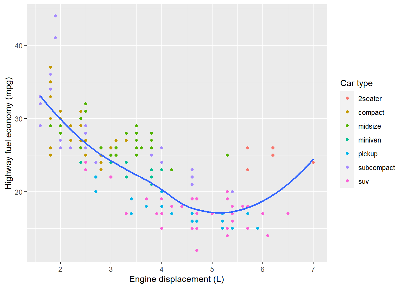 Answer: Plot see above.
- Take an exploratory graphic that you’ve created in the last month, and add informative titles to make it easier for others to understand.
bar <- ggplot(data = mpg, aes(fill=class, y=drv, x=hwy)) +
    geom_bar(position="stack", stat="identity")
bar + coord_polar() +
labs(
  x = "the type of drive train",
  y = "highway miles per gallon")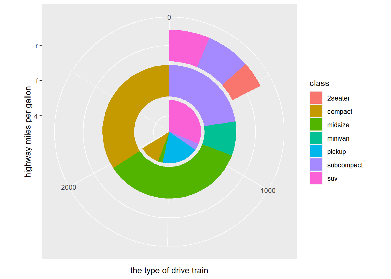
Answer: Plot see above.
Exercise 28.3.1
- Use geom_text() with infinite positions to place text at the four corners of the plot.
label <- tibble(
  displ = Inf,
  hwy = Inf,
  label = "I."
)

ggplot(mpg, aes(displ, hwy)) +
  geom_point() +
  geom_text(aes(label = label), data = label, vjust = "top", hjust = "right") +
  geom_text(aes(label = label), data = label, vjust = "top", hjust = "left") +
  geom_text(aes(label = label), data = label, vjust = "bottom", hjust = "left") +
   geom_text(aes(label = label), data = label, vjust = "bottom", hjust = "right")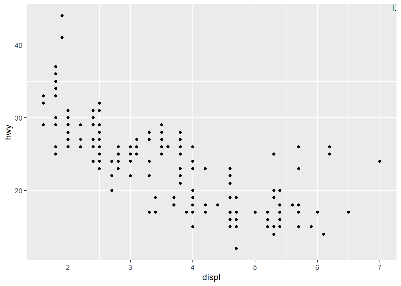
Answer: See plot above.
- Read the documentation for annotate(). How can you use it to add a text label to a plot without having to create a tibble?
#?annotate()#Answer: That can be done by specifying the limits of x and y
- How do labels with geom_text() interact with faceting? How can you add a label to a single facet? How can you put a different label in each facet? (Hint: think about the underlying data.)
Answer: That can be achieved by the well defined x and y coordinates.
- What arguments to geom_label() control the appearance of the background box?
#?geom_label#Answer: inherit.aes
- What are the four arguments to arrow()? How do they work? Create a series of plots that demonstrate the most important options.
#?arrow()#Answer: Arrow() seems to be not working.
Exercise 28.4.4
- Why doesn’t the following code override the default scale?
#ggplot(df, aes(x, y)) +#
  #geom_hex() +#
  #scale_colour_gradient(low = "white", high = "red") +#
  #coord_fixed()#
Answer: Fail to answer due to code error
What is the first argument to every scale? How does it compare to labs()?
Change the display of the presidential terms by:
Combining the two variants shown above.
Improving the display of the y axis.
Labelling each term with the name of the president.
Adding informative plot labels.
Placing breaks every 4 years (this is trickier than it seems!).

4. Use override.aes to make the legend on the following plot easier to see.


```r
ggplot(diamonds, aes(carat, price)) +
  geom_point(aes(colour = cut), alpha = 1/20)
\[\\[2in]\]